Student work
Font Metric Guide
Edgar Rios
ARTC 4305 (Typography III) #senior | 2016 | Texas, USA
This guide was produced in 2016 in my Type III course by student Edgar Rios. All 16 students in the class worked on the same assignment; it was the third and final project of the fall semester.
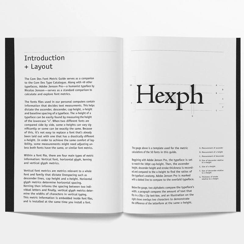
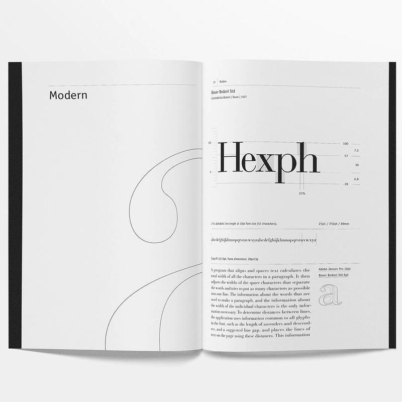
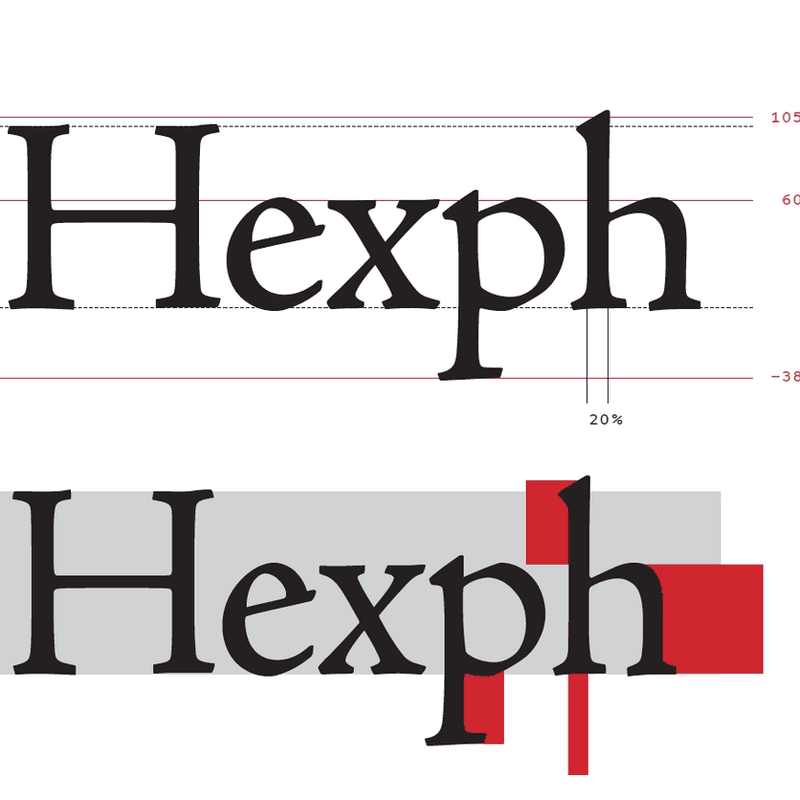
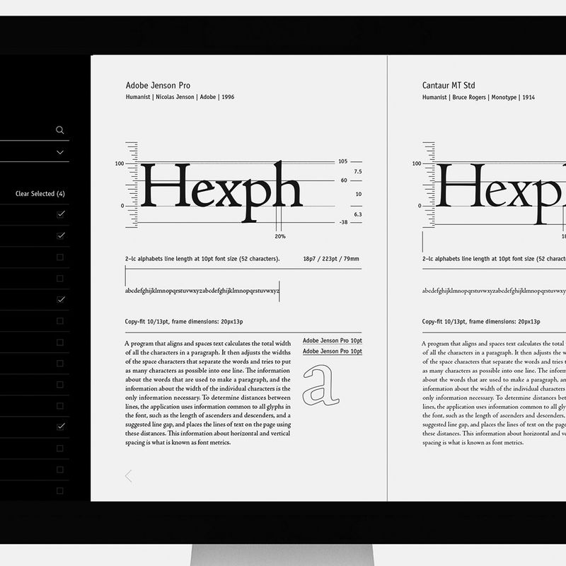
The assignments builds up on the previous catalog produced in the same class in 2015. The guide compares 50 different fonts to the metrics of Adobe Jenson. It serves as an analytical exercise to dig deeper into type metrics, and as a useful resource for students to pair typefaces that have common body/space features.
The core of the project is actually a gauge I first saw and digitized from Adrian Frutiger’s Typefaces. The Complete Works, a small yet essential scientific object to visualize the metrics and their relations, and to have students calculate the ratios solving equations. See Frutiger’s version on p.117 in this sample.
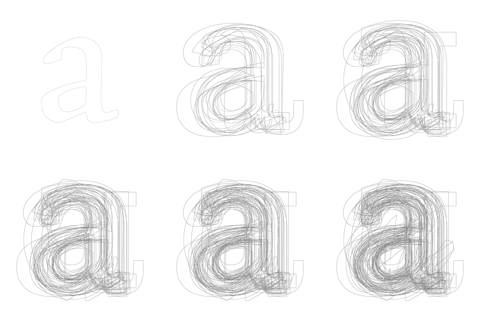
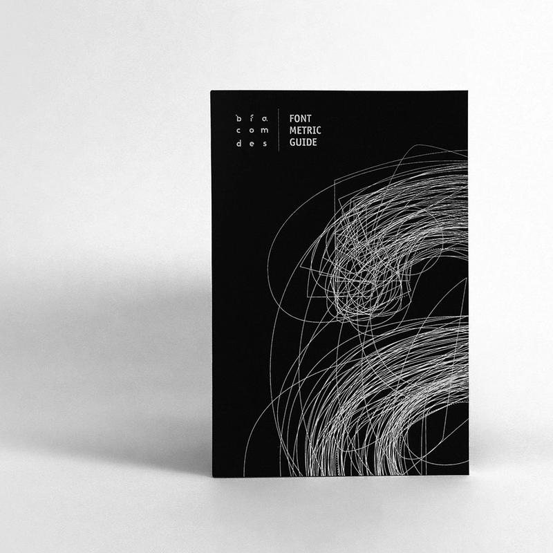
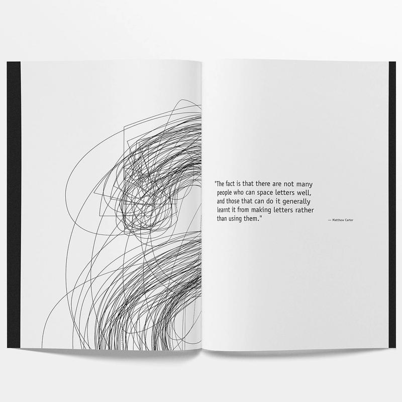
The cover of Edgar’s guide was screen-printed with a crop of overlaid “a” character outlines of the 50 fonts present in the booklet. Adobe Jenson can be seen as a dotted line, and the first character to appear in the animation he designed. Along with the guide, the student developed a prototype of a web version of the study, that makes it easy to find a specific font within the guide: multiple fonts can be selected to be viewed side by side to compare metrics. The photography of the book samples is Edgar’s neat work as well, for his portfolio documentation.
The project received a recognition at the 13th Annual National Student Show & Conference.
Material: School lab font library, InDesign, paper, screen-printing, digital printing, binding material.
