Projects
IUE FFAD Doors
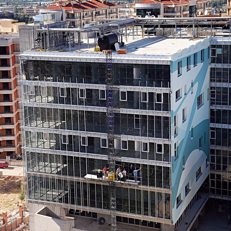
In 2009–2010 I was part of an exciting project, the new building for the Faculty of Fine Arts and Design at Izmir University of Economics (IUE) in İzmir, Turkey.
Its design, from the floor plan to the lettering on the doors, was the result of a group effort by members and students of that faculty, and other people connected to the university. The result represented both the faculty and its five individual departments (Architecture, Interior Architecture, Fashion, Industrial Design and Visual Communication Design). Several departments conducted student projects on the studios, relaxing spaces, and signage for the building.
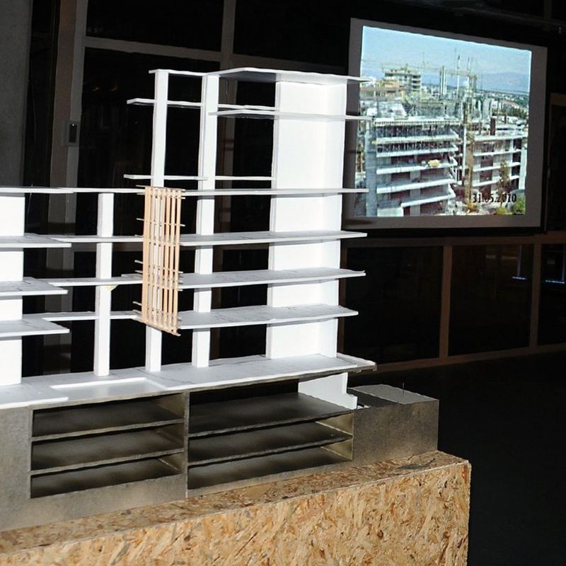
Design School buildings require special spaces — studios where the practical side of the profession can be taught, and areas to judge and exhibit students’ works. These specific aspects, and combining them with regular classrooms and offices to form a functioning whole, are the challenge to any architect who designs such a school.
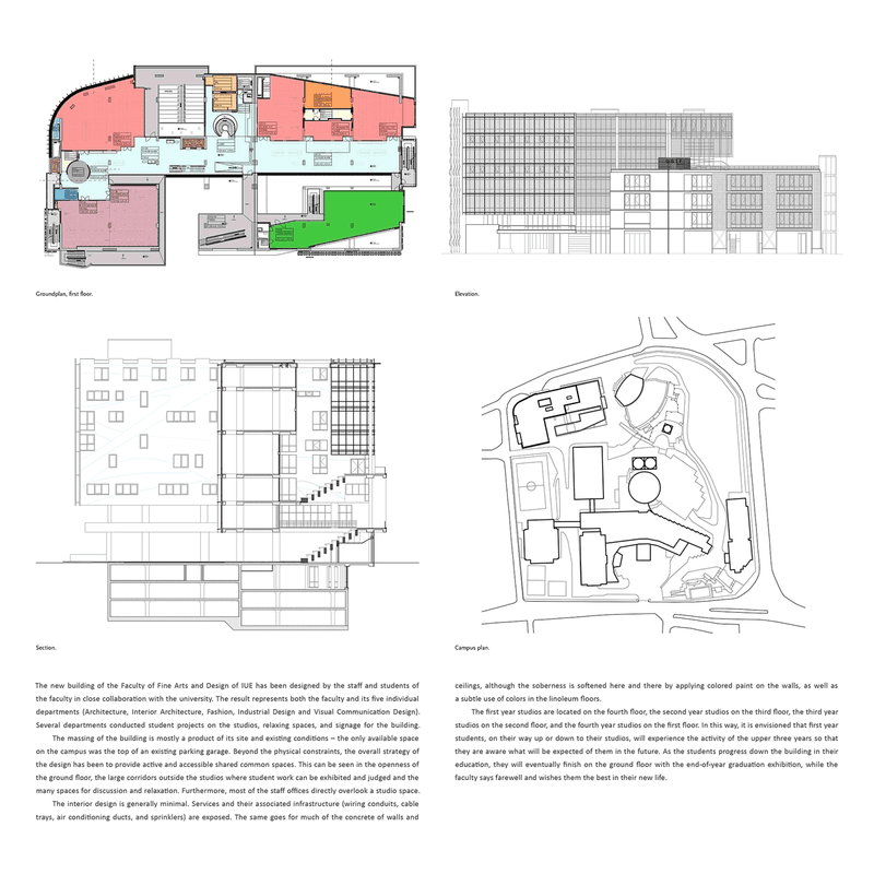
The overall strategy of the design was to provide active and accessible shared common spaces — the openness of the ground floor, the large corridors outside the studios where student work can be exhibited and judged and the many spaces for discussion and relaxation. Furthermore, most of the faculty offices directly overlook a studio space. The interior design was generally minimal. Services and the associated infrastructure (wiring conduits, cable trays, air conditioning ducts, and sprinklers) are exposed. The same goes for much of the concrete of walls and ceilings, although the soberness and industrial look was softened here and there by applying colored paint on the walls, as well as a subtle use of colors in the linoleum floors and carpets.
The first year studios were located on the fourth floor, the second year studios on the third floor, the third year studios on the second floor, and the fourth year studios on the first floor. In this way, it was envisioned that first year students, on their way up or down to their studios, will experience the activity of the upper three years so that they are aware what will be expected of them in the future. As the students progress down the building in their education, they will eventually finish on the ground floor with the end-of-year graduation exhibition.
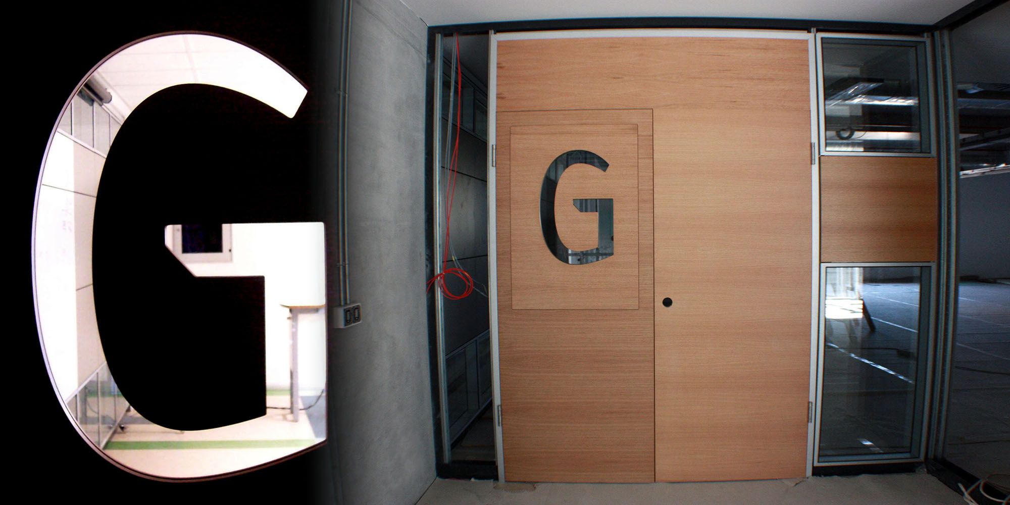
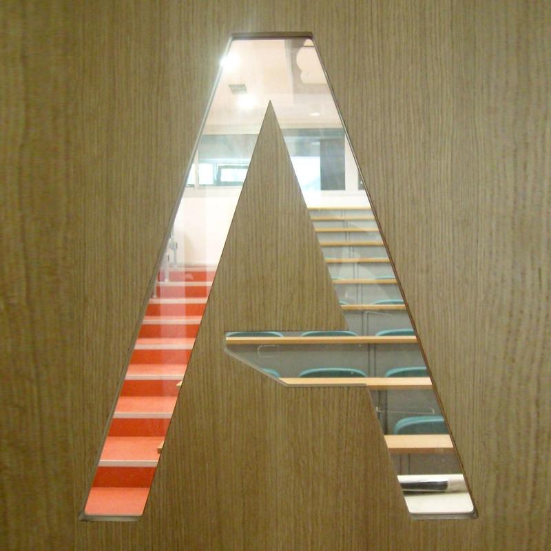
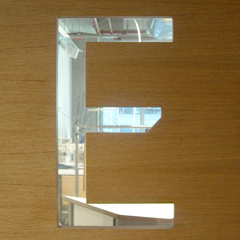
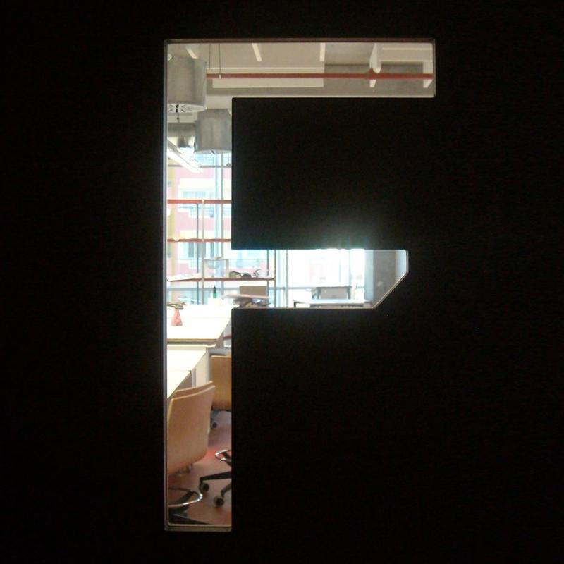
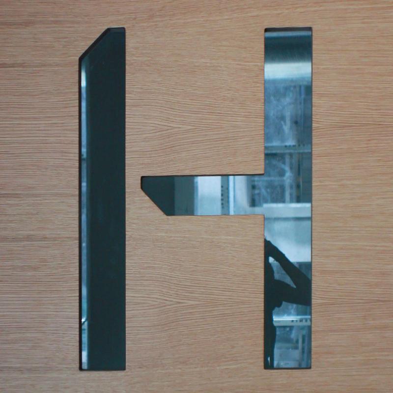
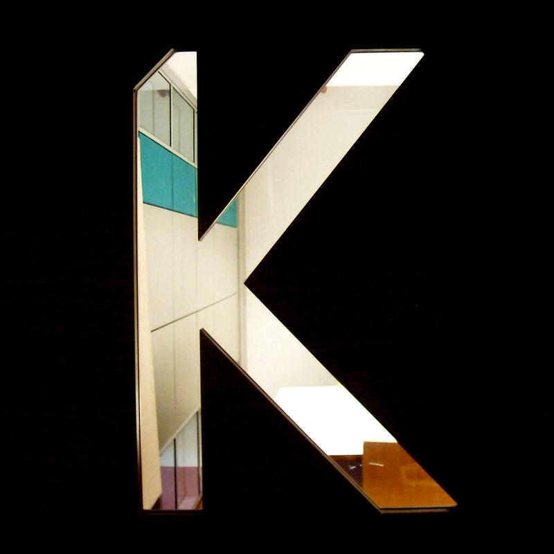
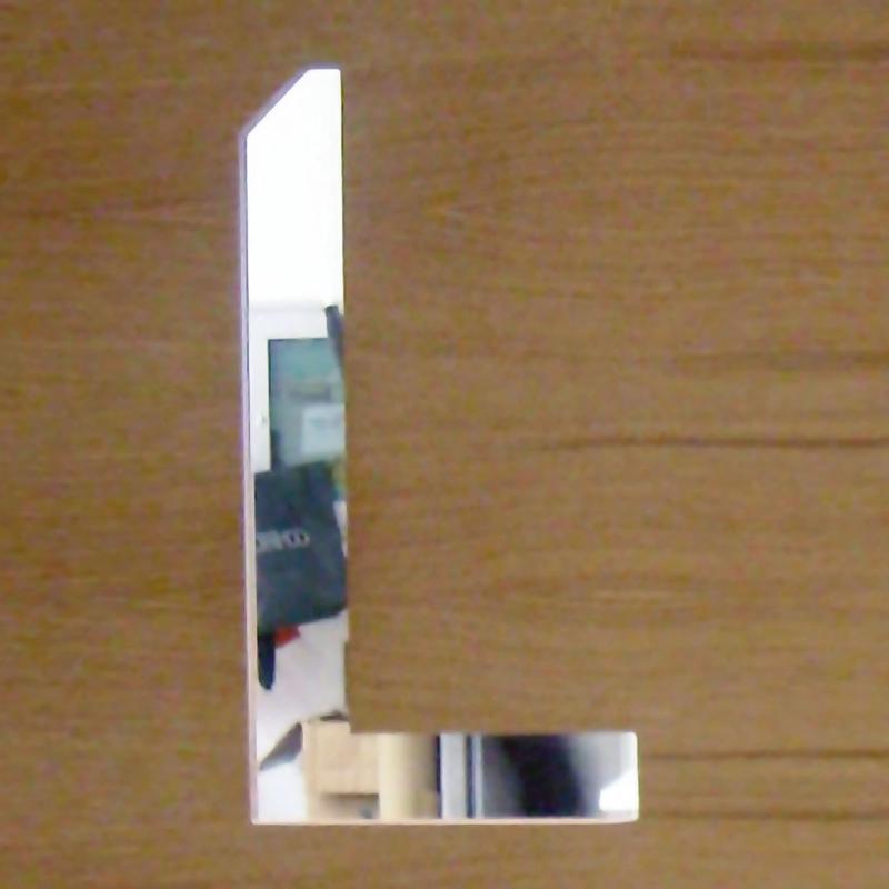
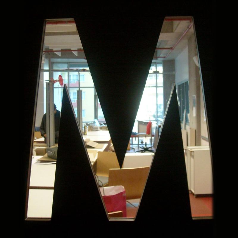
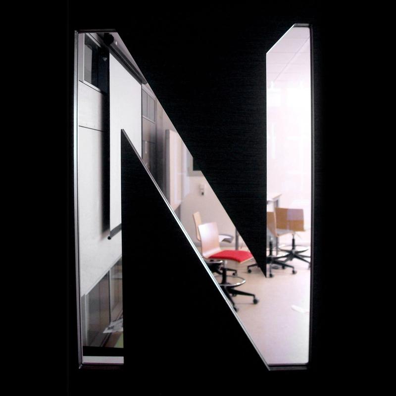
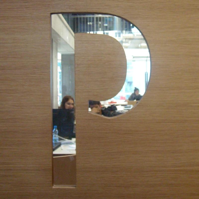
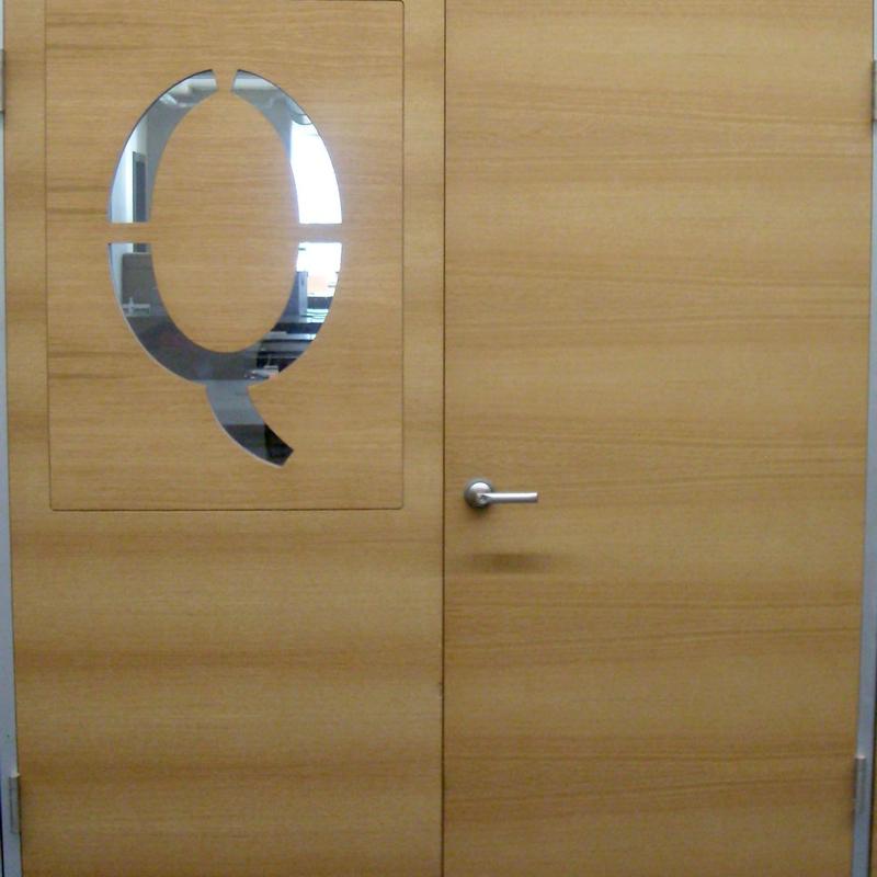
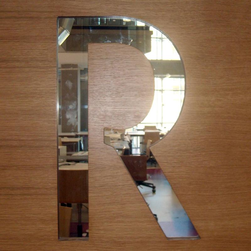
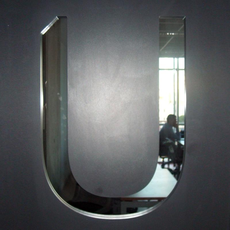
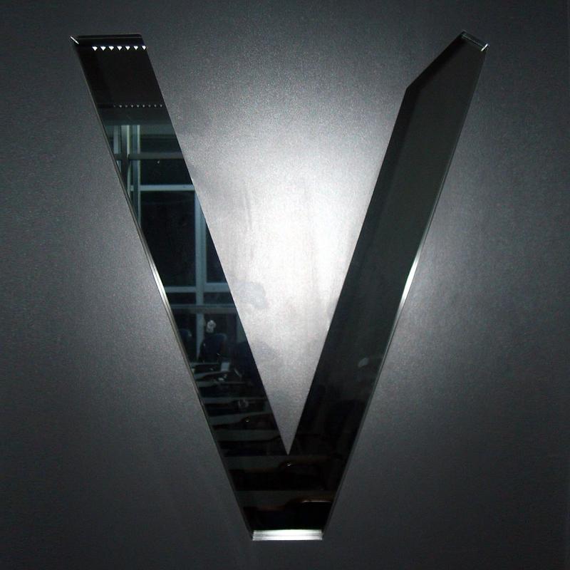
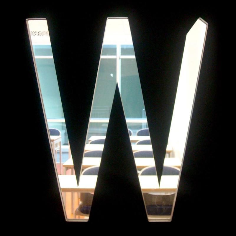
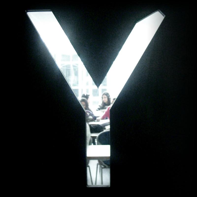
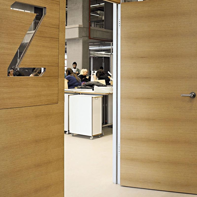
When the idea of having special/custom doors was presented to me for a solution, I inspected how peephole shapes could be integrated in a system for the new building identity, within a desirable application supporting the zoning planned for the building. Conceptually, I drew from Alan Cooper, asking myself: Why can’t the information be the interface?
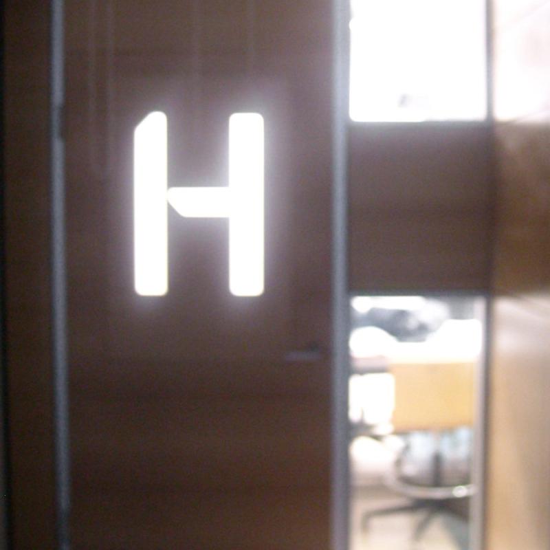
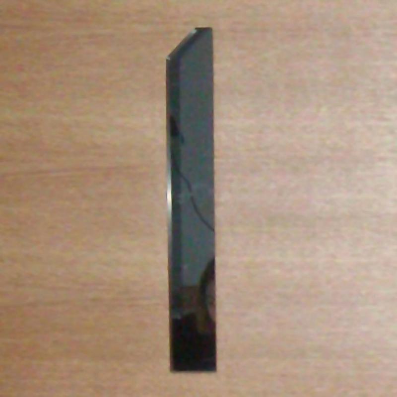
I produced a set of optically adjusted (application/layout specific) stencil letterforms, from the caps of my font Hemingway Medium, a typeface design that already has a stencil component.
The doors became part of the language in the school — as a meeting point or to navigate the four floors, and as a visual link to the studios and classrooms. Information architecture, just like typography is a glass-like tangible area, for its service and clarity qualities. Seeing my drawings applied, students and colleagues looking at large letters as a gateway for other meanings or behavior was an enriching experience, and a way for me to gauge such qualities of type.
Through the research for this project I collected EGD material and acquired information I now share with students in my wayfinding exercise.
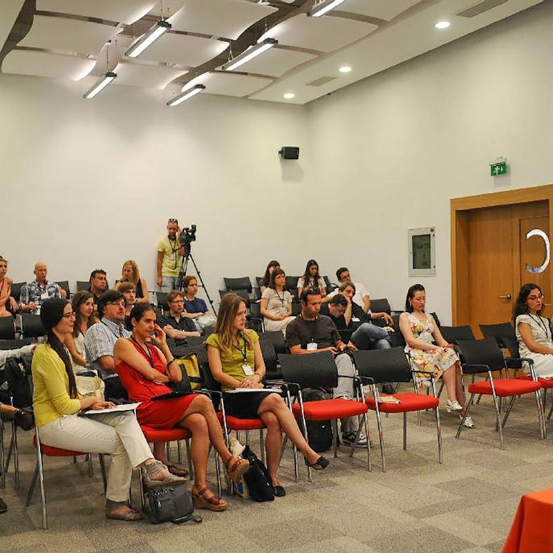
The completion and opening of the IUE FFDA new building happened on October 20, 2010, and was celebrated with an exhibition titled “Design School Design” curated by Xander van Eck & Tom Keogh, to which I contributed as graphic designer.
Material: Digital vector drawings, Fontlab, wood, glass.
