Presentations
The 20th Century Bodonians
Here is an attempt to illustrate and inform about the most relevant (metal/film/digital) cuts of Bodonian typefaces through all ’900, plus it is a synopsis on the work of the 20th Century Bodonian typographers Mardersteig, Tallone, and Franco Maria Ricci. It was originally presented as a talk at the 3rd ICTVC, International Conference on Typography & Visual Communication, at the University of Macedonia, in Thessaloniki, Greece (2007).
The talk stems from “The 20th Century Bodonians and Bodoni’s Heritage,” an article I co-written with Fabrizio M. Rossi, published on the Italian international graphic design journal Progetto grafico 9 (issn 1824-1301).
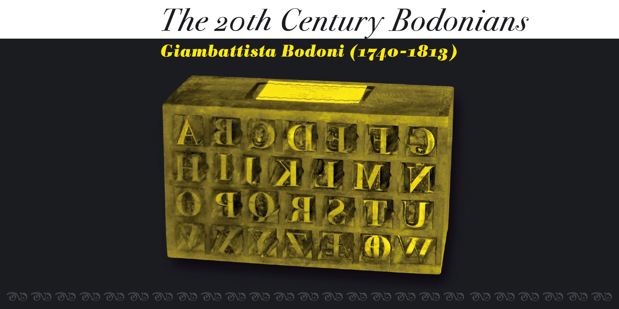
Giambattista Bodoni (1740–1813) was called the King of Printers; he was a prolific type designer, a masterful engraver of punches, and the most widely admired printer of his time. His books and typefaces were created during the 45 years he was the director of the fine press and publishing house of the Duke of Parma in Italy. He produced the best of what are known as “modern” Roman style types, based off the finest writing of his time. Modern types represented the ultimate typographic development of the late eighteenth and early nineteenth centuries. They have characteristics quite different from the types that preceded them; such as extreme vertical stress, fine hairlines contrasted by bold main strokes, and very subtle, almost non-existent bracketing of sharply defined hairline serifs. Bodoni saw this style as beautiful and harmonious — the natural result of writing done with a well-cut pen, and the look was (and is) fashionable and admired.
In fact, Bodoni spent his entire life building a large collection of over 400 fonts. He started with Fournier’s types as a model, and over time developed a personal style that tended toward simplicity, austerity and a greater contrast between the vertical stems and hairlines than previously seen, resulting in what we know today as the modern Roman face.
In the preface of his “Manuale Tipografico” (1818) Bodoni stated: “It is proper here to offer the four different headings under which it seems to me are derived the beauties of type, and the first of these is regularity — conformity without ambiguity, variety without dissonance, and equality and symmetry without confusion.”
Notes
The included cuts are the following:
ATF Bodoni (1911, Morris Fuller Benton)
Bauer Bodoni (1926, Henrich Jost, Louis Höll)
Berthold Bodoni Antiqua (1970, Günther Gerhard Lange, Karl Gerstner)
Ludlow Bodoni Modern (1936, Robert Hunter Middleton)
Tippecanoe (1942, William Addison Dwiggins)
Letraset Carousel (1966, Gary Gillot)
Berthold Bodoni Old Face (1983, Günther Gerhard Lange)
WTC Our Bodoni (1989, Tom Carnese)
PDM Bach Bodoni (1989, Piero De Macchi)
FF Bodoni Classic (1994, Gert Weischer)
ITC Bodoni 72,12,6 (1994, Sumner Stone, Holly Goldsmith, &c.)
Emigre Filosofia (1996, Zuzana Licko)
Linotype Gianotten (1999, Antonio Pace)
PreussTYPE Battista (2005, Ingo Preuß)
Novarese’s Bodoni Revivals (1961–1989, Aldo Novarese)
For a concise biography, in which Bodoni’s reputation as the “Printer of Kings and King of Printers” is illuminated, please refer to my article edited by Mark Jamra for download at TypeCulture®.
Type historian Paul Shaw published a review of ITC Bodoni originally written for Print magazine.
Nancy Stock-Allen wrote a fine review of the Bodoni Museum in Parma at her blog.

