Student work
Type Design & Basics of Fontography
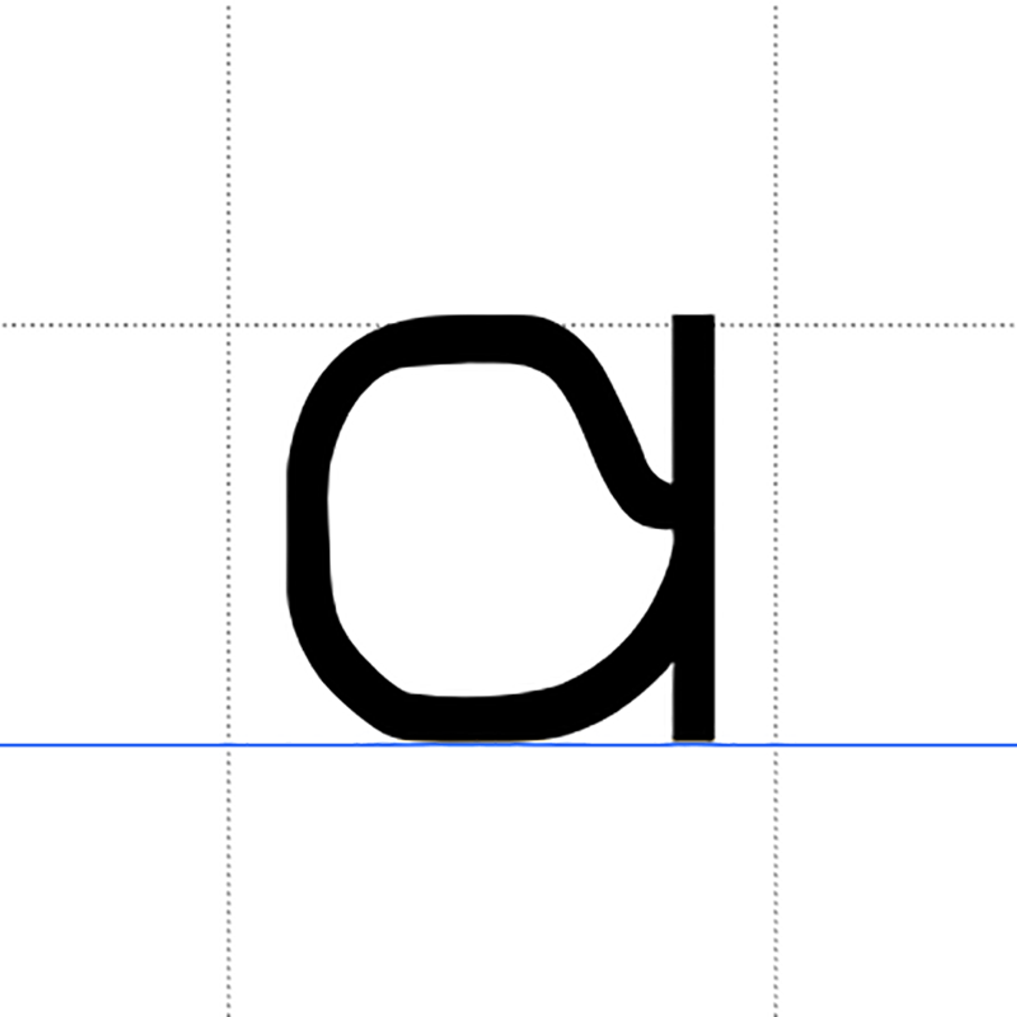
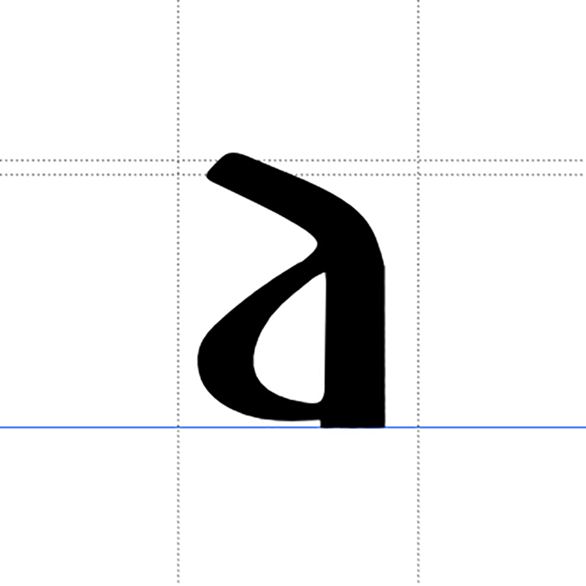
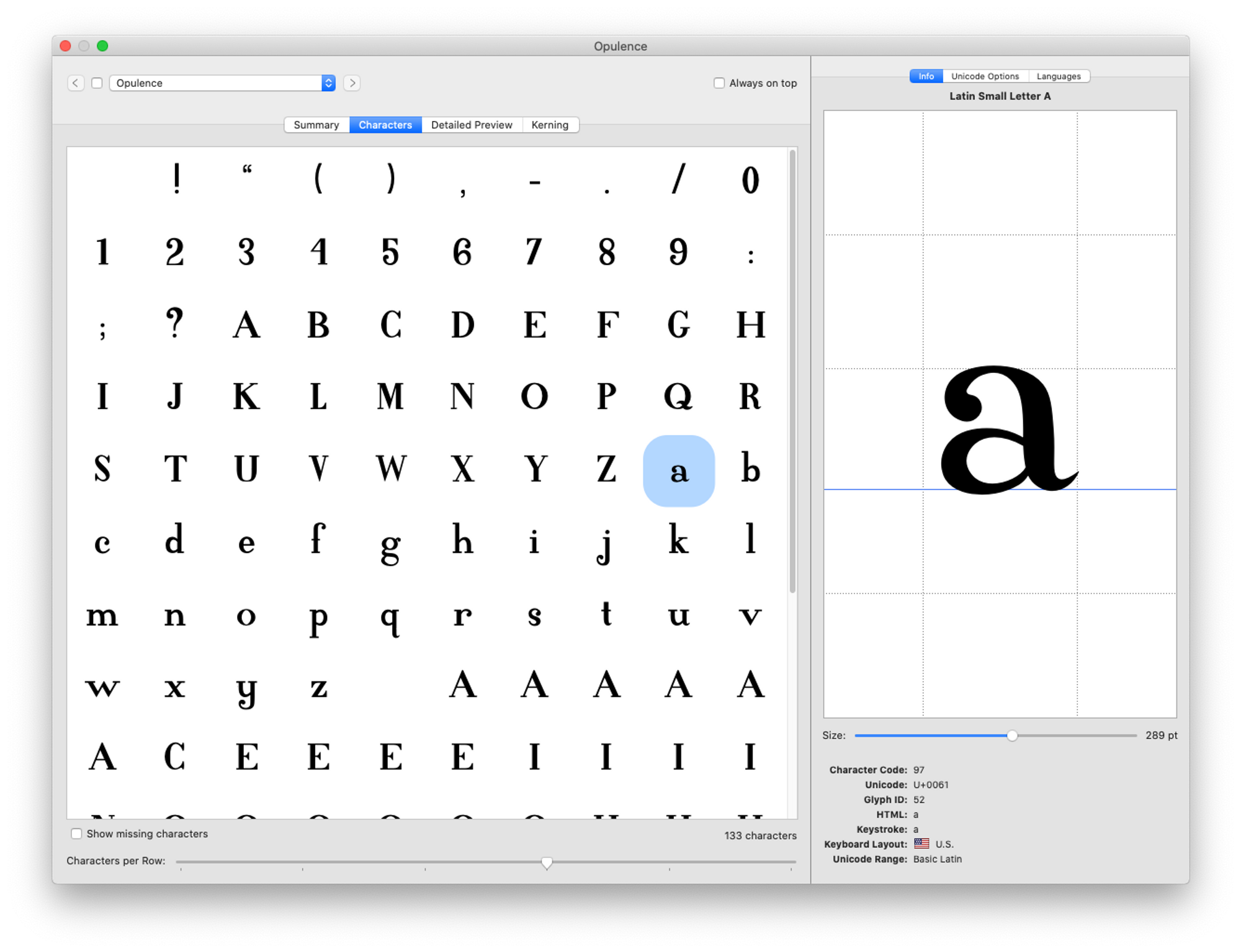
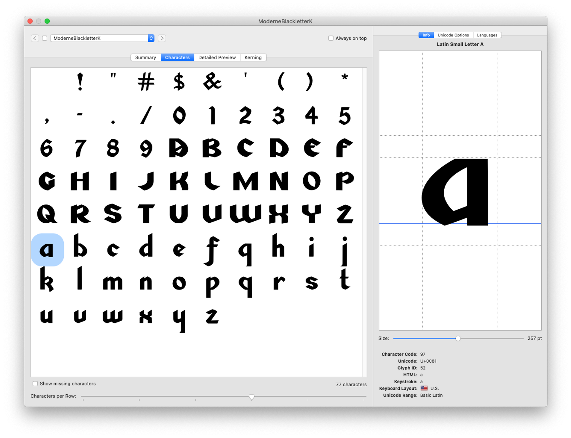
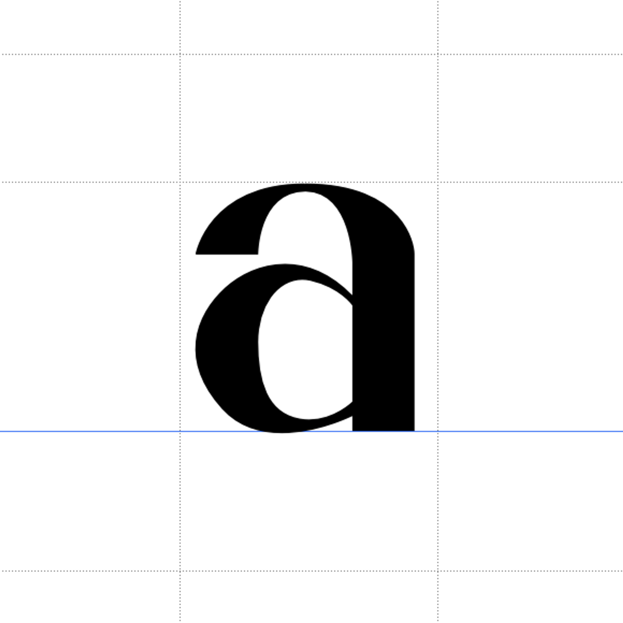
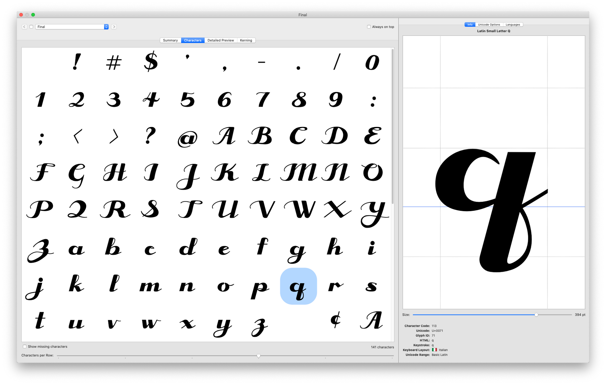
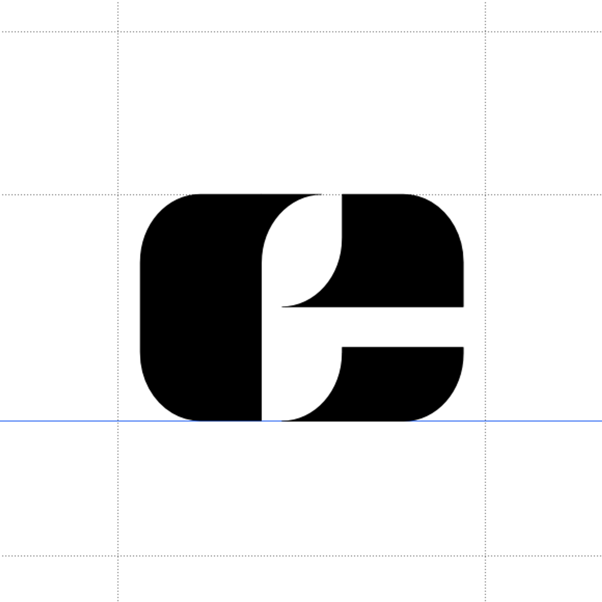
![Wissing’s Opulence [a]](https://cdn.sanity.io/images/pd4vrxjx/production/d99dbd943a2d67d6327e7a7e58f32338f9cf4b82-800x800.png?w=2000 "Wissing’s Opulence [a]")
Multiple students
ARTS 481 (Special Studio Projects: Graphic Design) #senior | 2021 | New York, USA
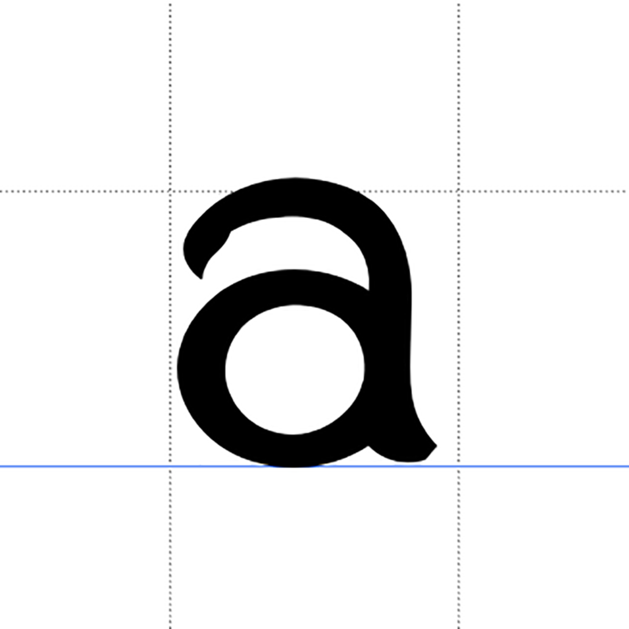
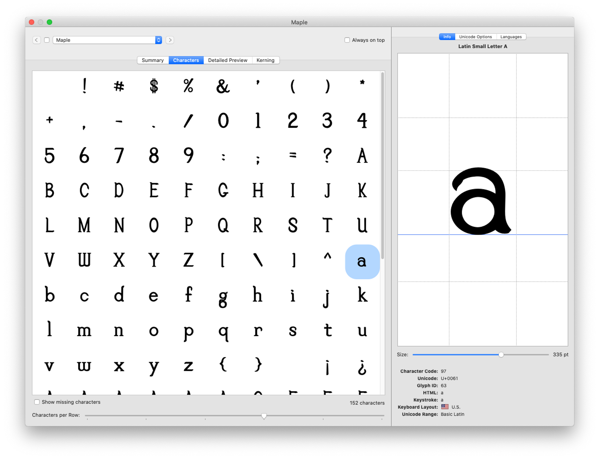
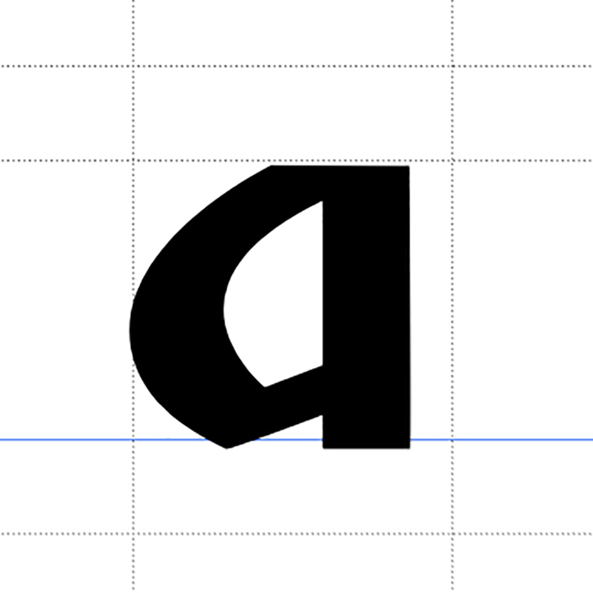
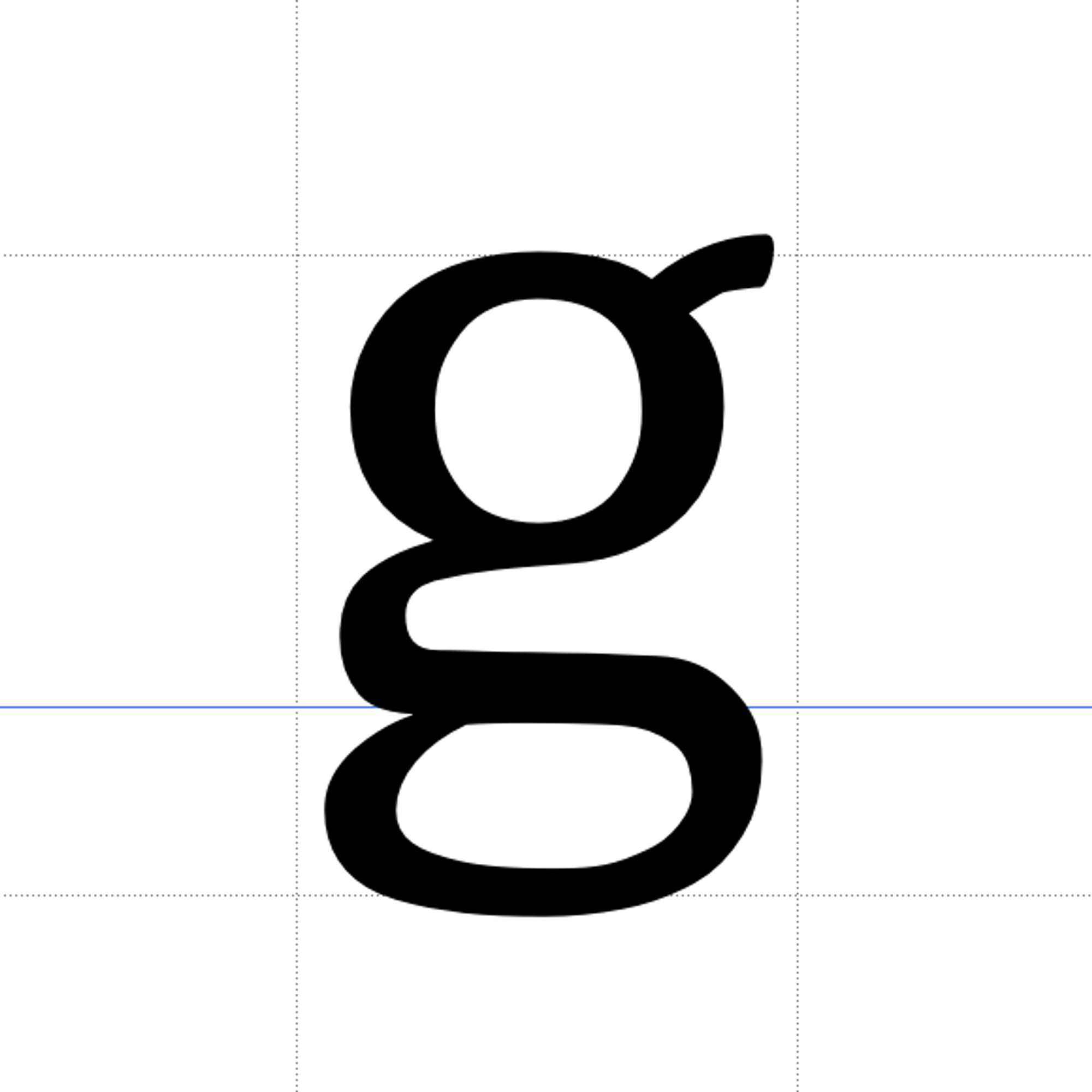
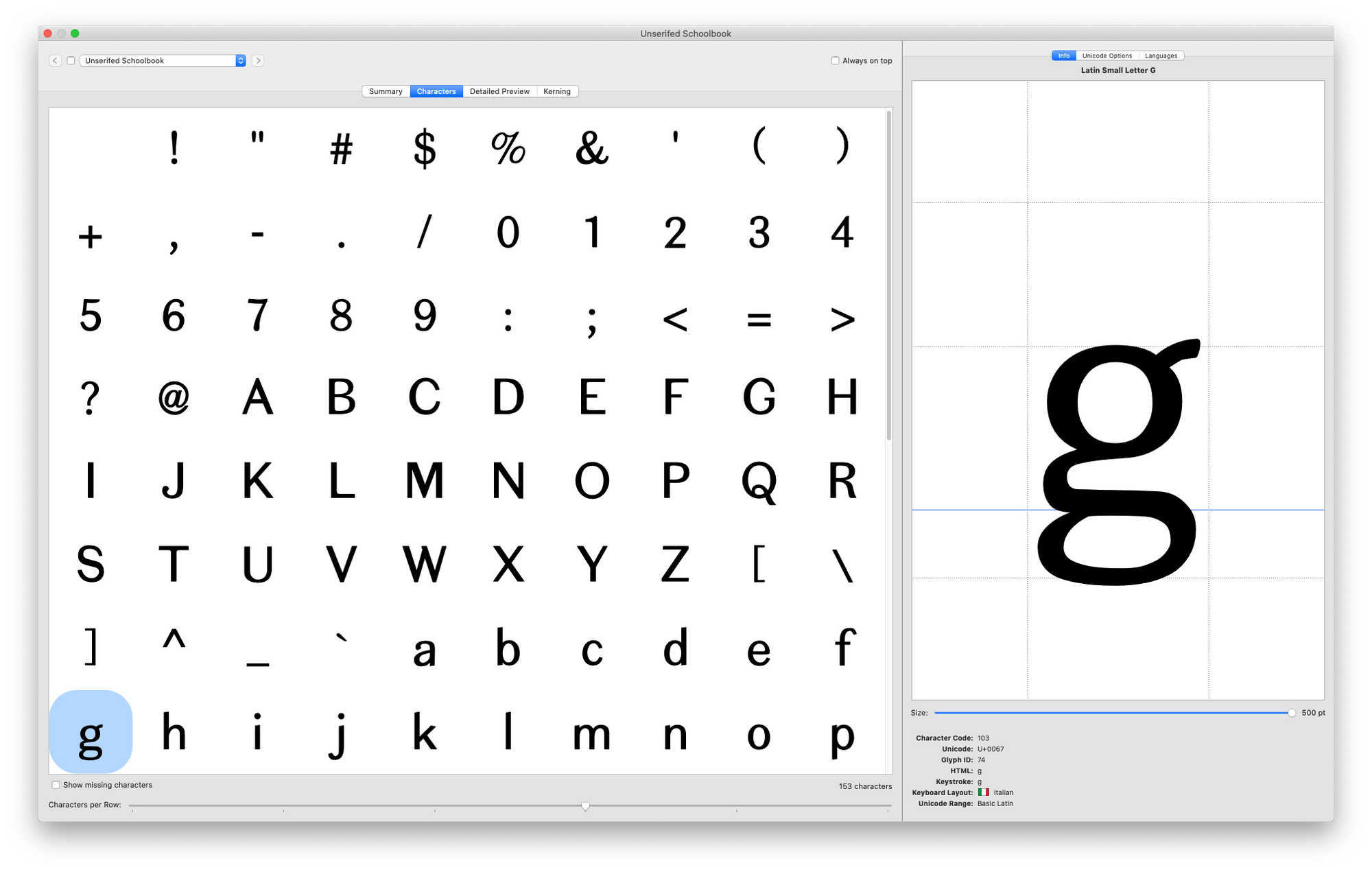
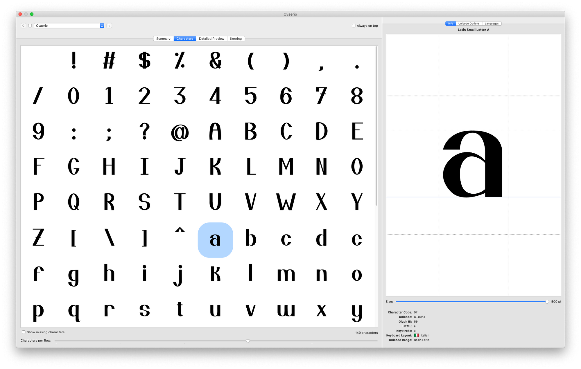
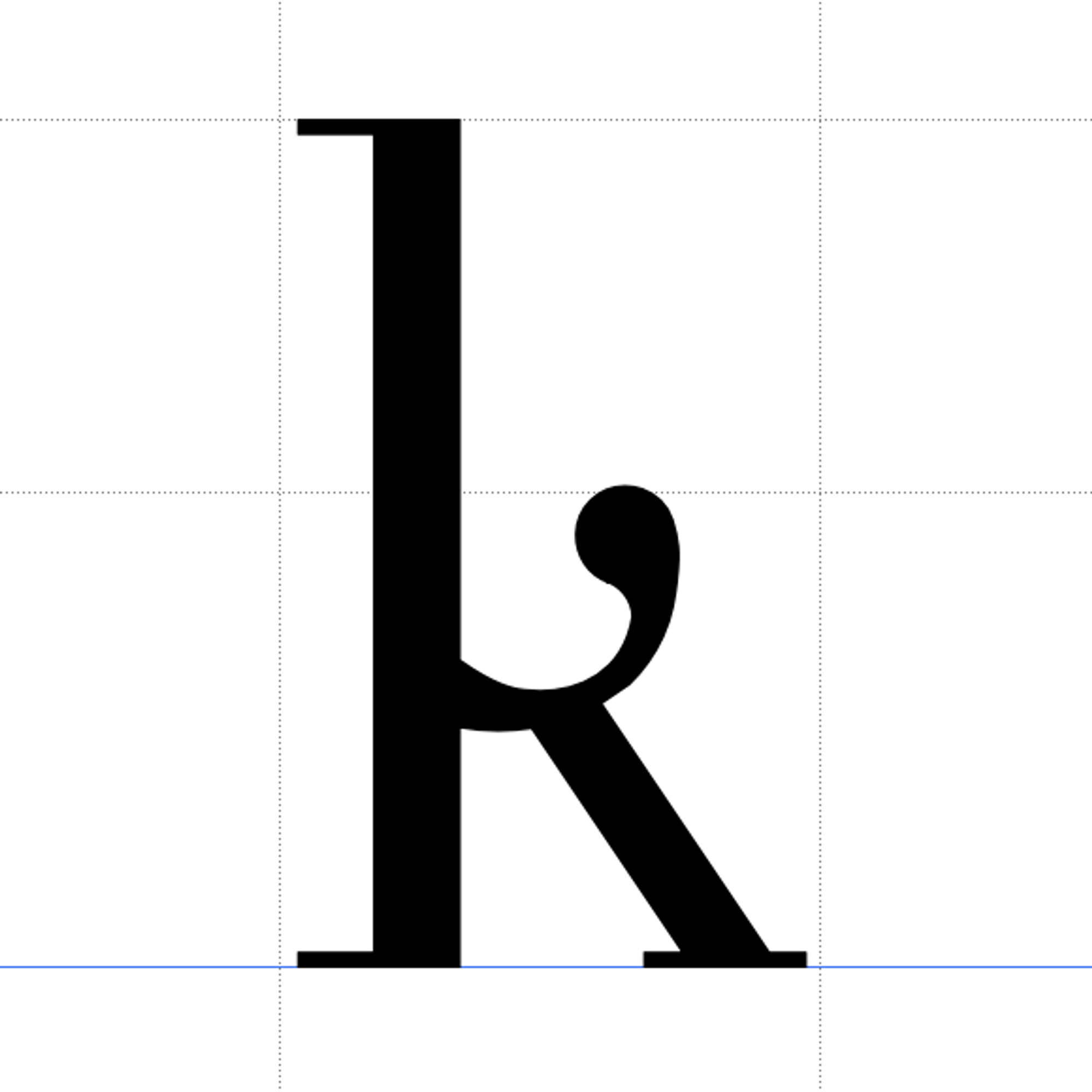
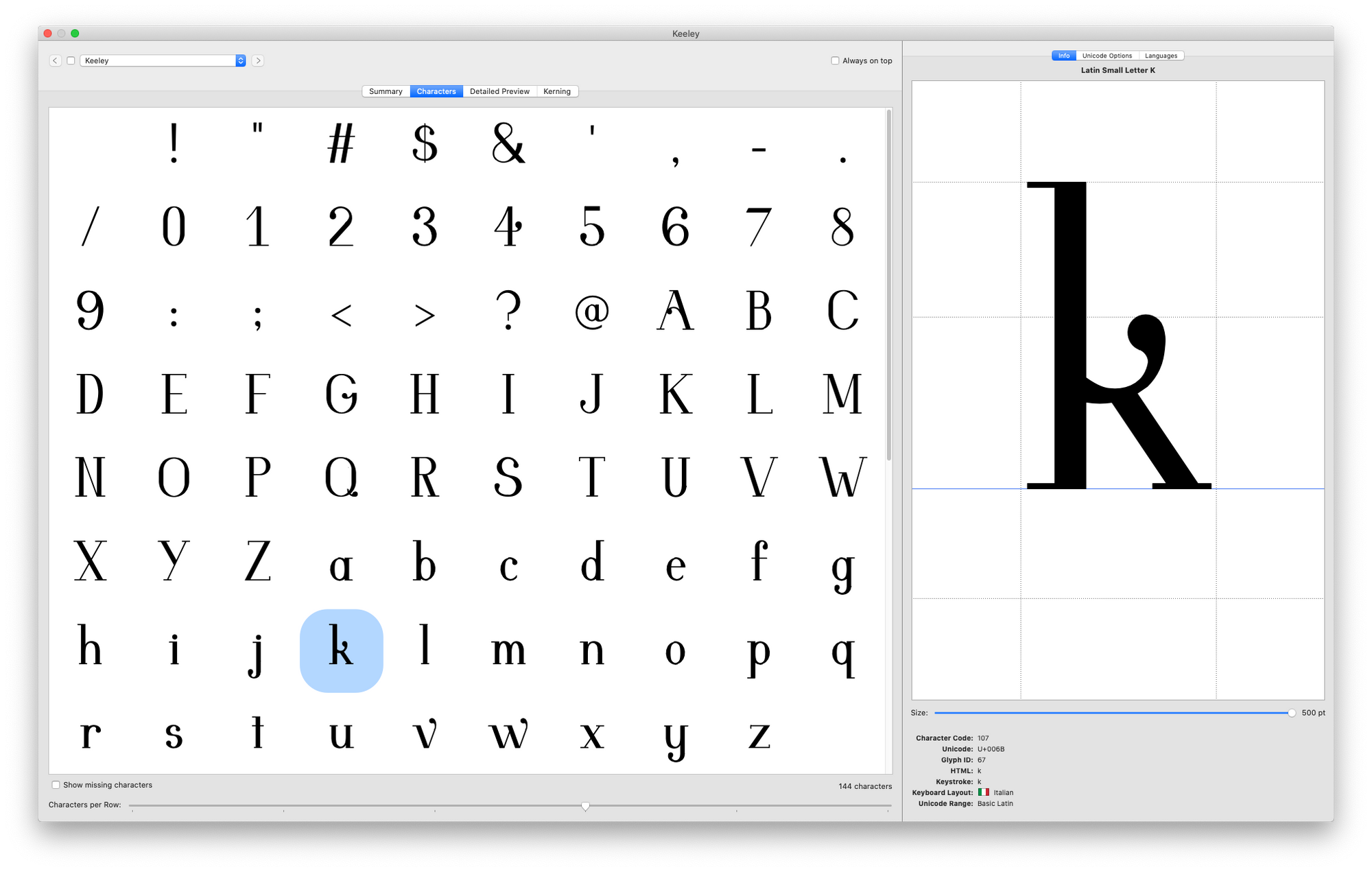
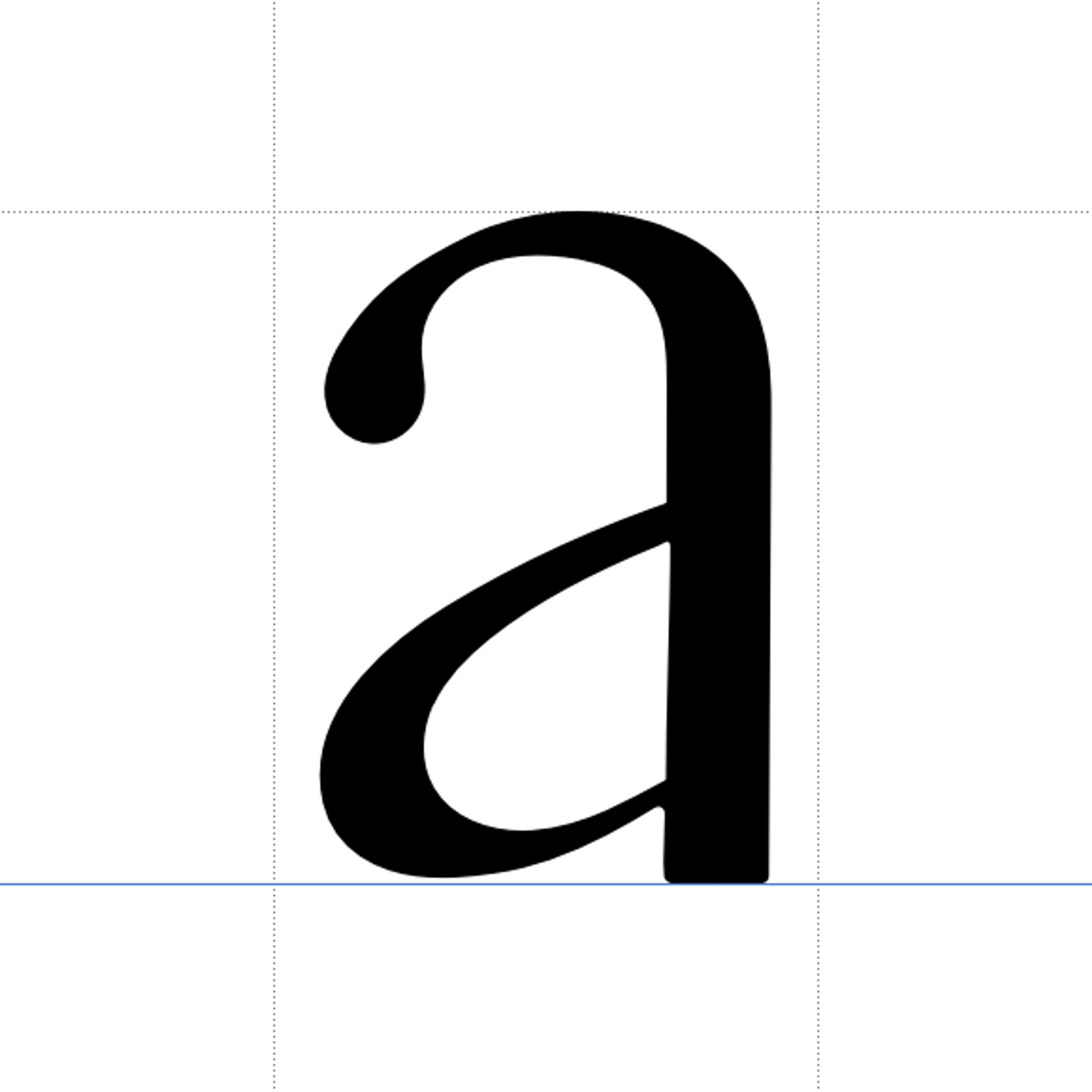
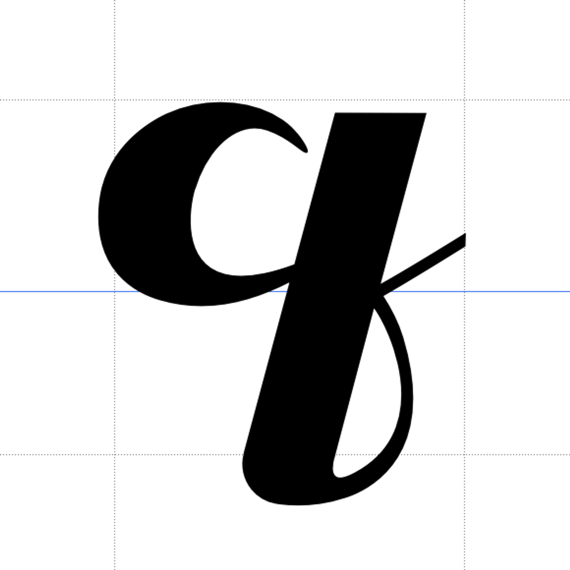
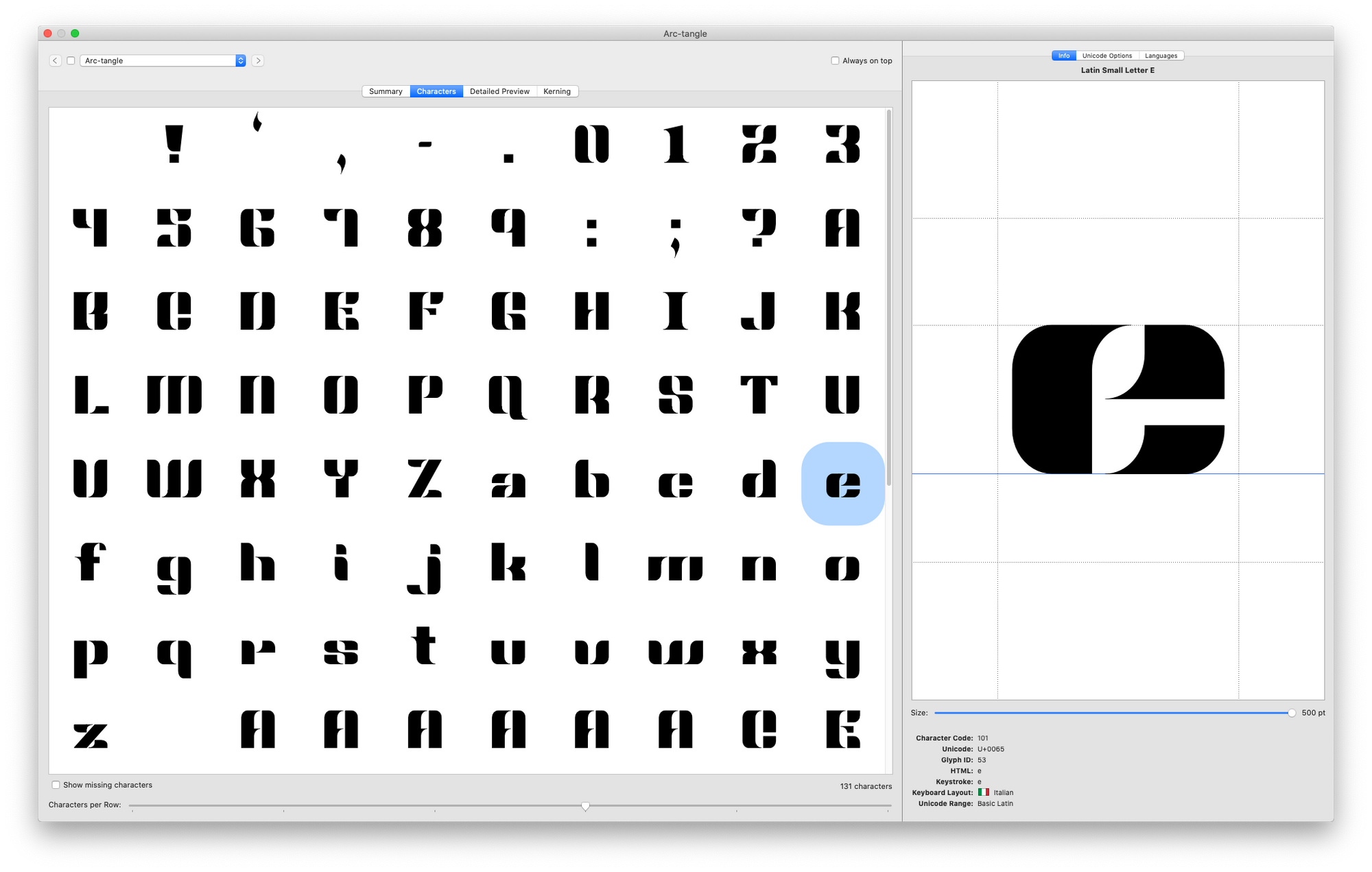
The 10-week long task challenges students to draw an original text (not decorative) typeface by hand, then digitize the letterforms into an OTF font using Fontself. The main industry font making softwares (Glyphs, Robofont, Fontlab) are presented to the students during the course of the project. The font design is presented with a type specimen poster or publication. Students have the following three options to chose from:
1. Un-serif a seriffed classic or established text design.
2. Design a typeface to solve a specific problem.
3. Draw a theoretical typeface following a 10-parameter recipe.
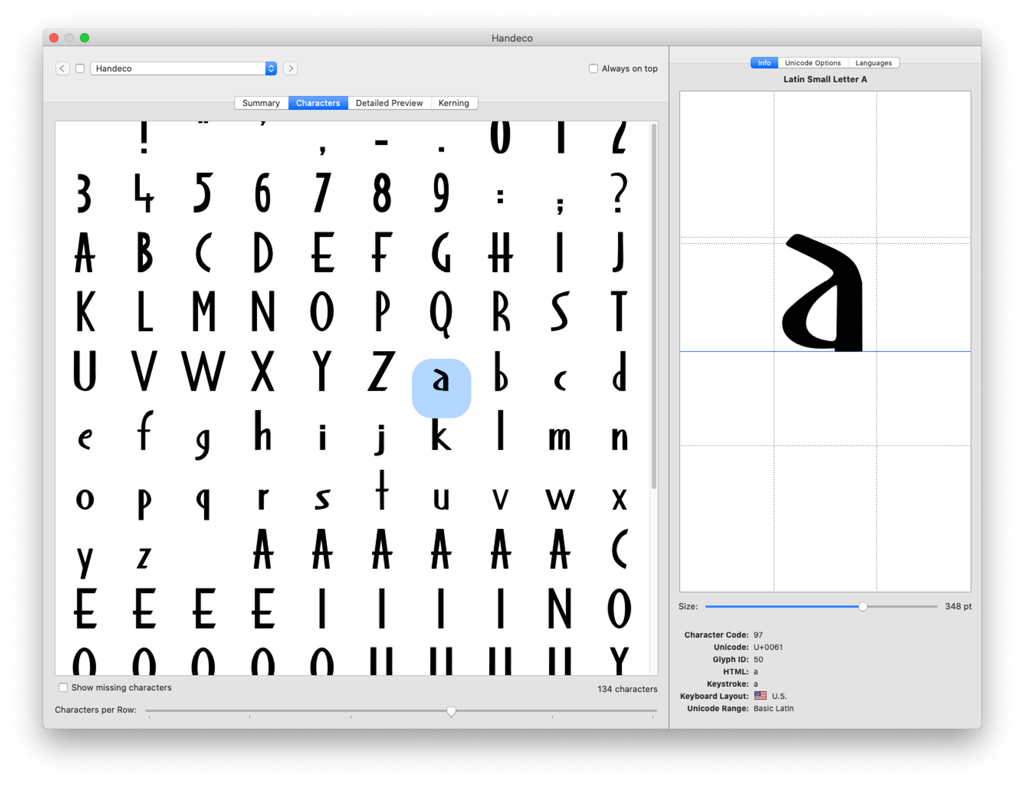
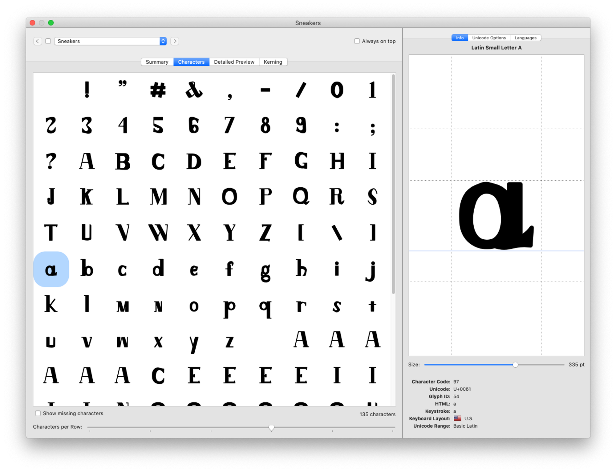
Students practice the basics of typeface design and spacing, and prototype the design into a font to write (set type) with. Brian Wissing created a 3' short “promo” film applying the font for the screen text.
Material: Pencil, paper, Illustrator, Acrobat, Fontself, FontGoggles.
§
“The fact is that there are not many people who can space letters well, and those that can do it generally learnt it from making letters rather than using them.”
—Matthew Carter
“A type designer does not draw letters. A type designer designs words and words are structures that contain patterns of black and white shapes, form and counterform. It is a game that deals with space and rhythm. Which is precisely what, for me, is the essence of drawing.”
—Cyrus Highsmith
“Lettering is, in many ways, the opposite of type design. Whereas type design creates letters that must function under the broadest possible circumstances, lettering is created for the most narrow of applications.”
—James Montalbano
“The letter width is interconnected with, and cannot be separated from, the letter spacing. […] As we type designers have tried and tried and tried to convey to aspiring letterers, ‘Drawing and spacing are one and the same’.”
—John Downer
“Transformed documents and new platforms push the demand for ever more typefaces that are typographically rich, wide in script coverage, and tailored for use on a wider range of environments: not just different surfaces (screens, print-on-demand, and traditional presses) but also different canvases: spreads, pages, and columns of hugely variant sizes, each with its own demands on line density, contrast, and spacing. Two factors add substantially to this need. Firstly, the explosion of mobile networks in regions where cable-based broadband is scarce, means that critical communications are restricted to smaller screens that render primarily text. Secondly, the speedy adoption of tablets, which are agnostic devices that do not convey any functional aspects of the documents they render. (In other words, the devices do not explain the interaction, like a print document does. The navigation arises from the document’s typographic design, not its material qualities.) The four main tools of typographic design become the main carriers of any identity everywhere: typefaces, spacing, visual hierarchies, and color are the only reliable identifiers.”
—Gerry Leonidas