Student work
Stencil: Stainless Steel, type design & exhibition

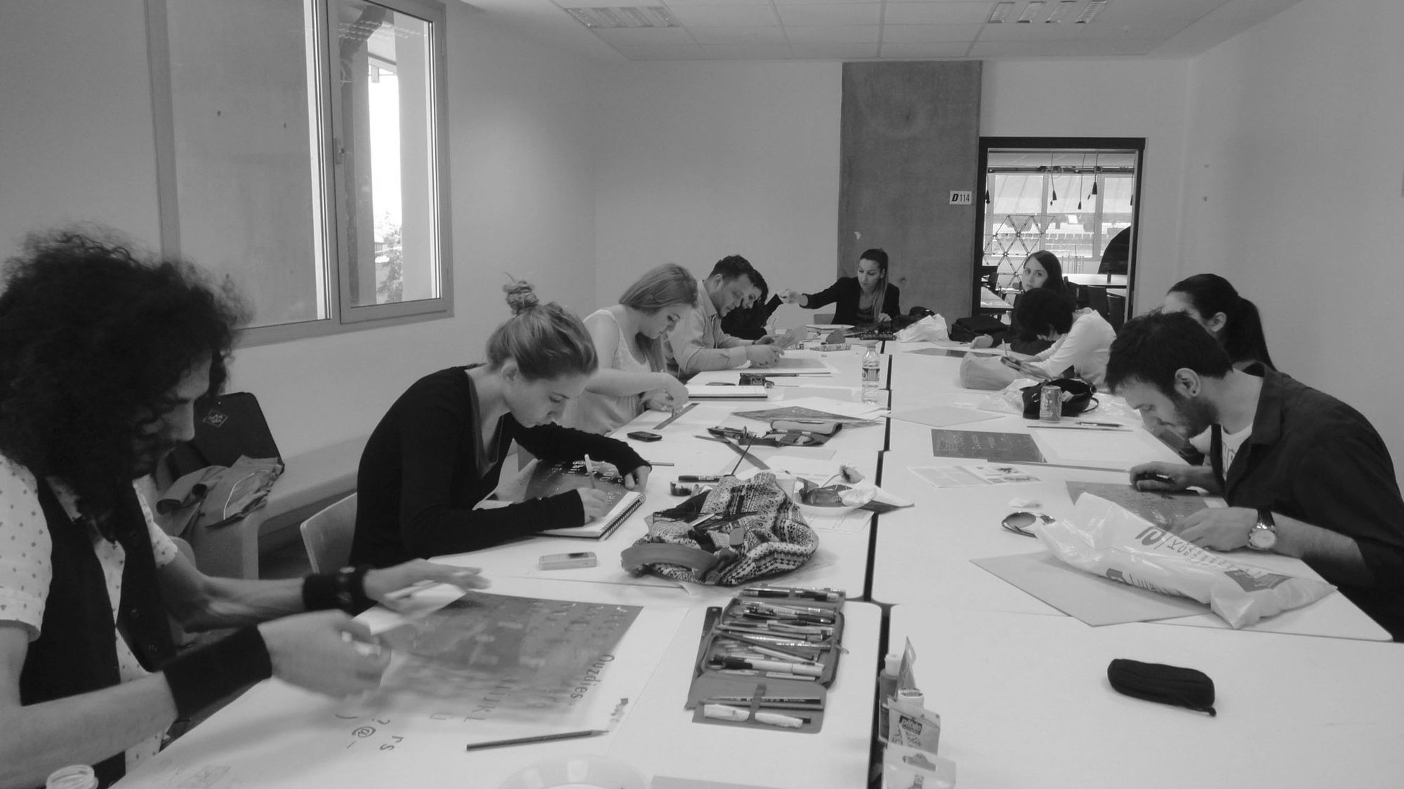
Multiple students
CD 204 (Typographic Design II) #junior | 2012 | Turkey
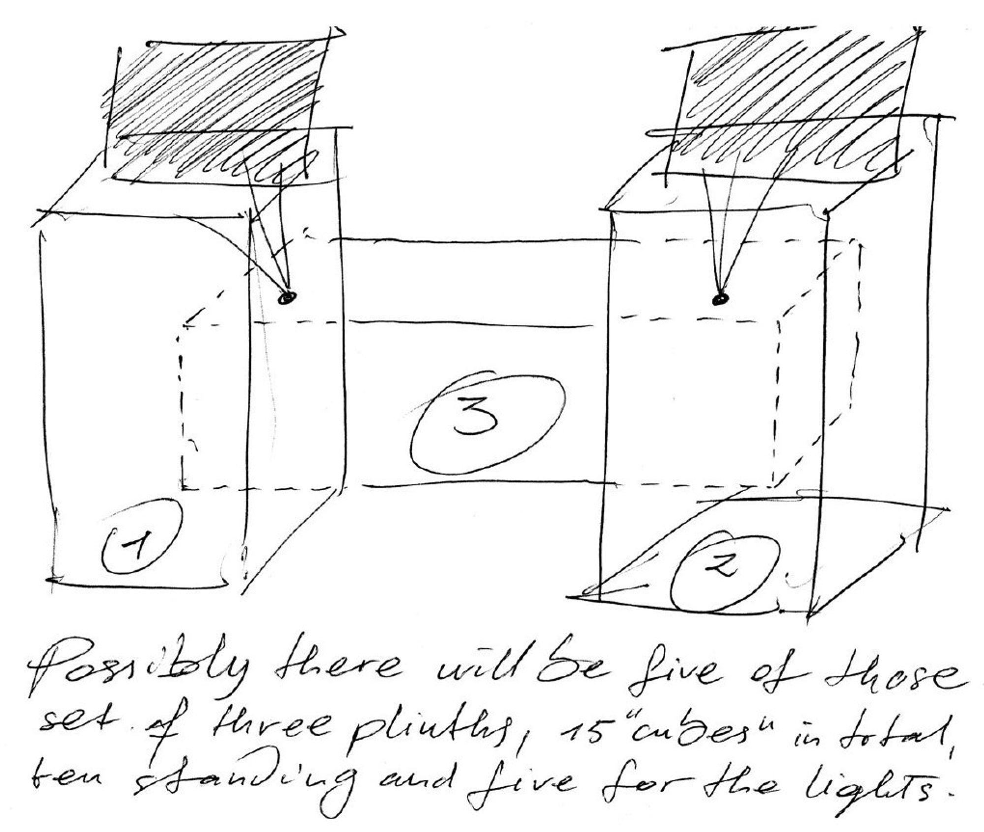
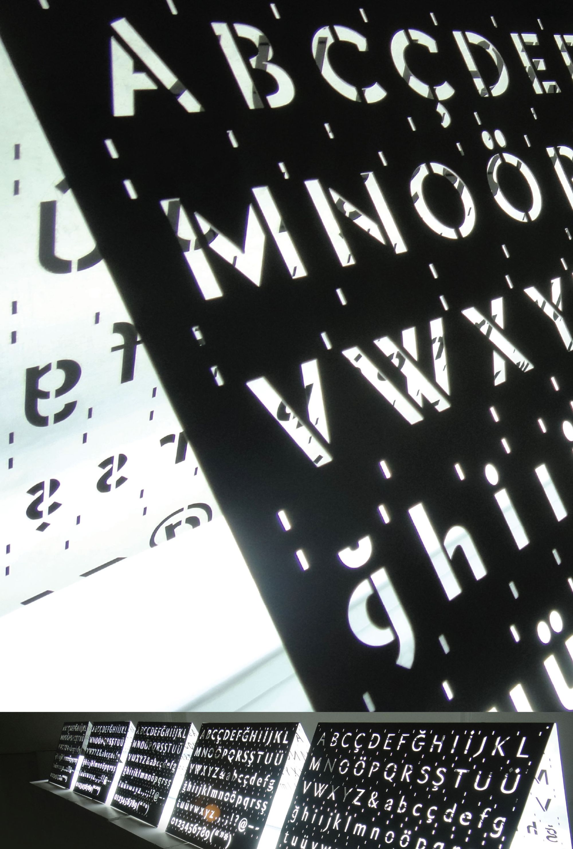
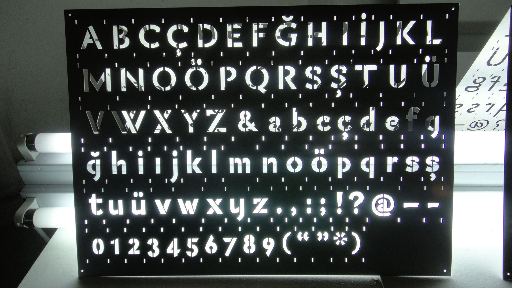
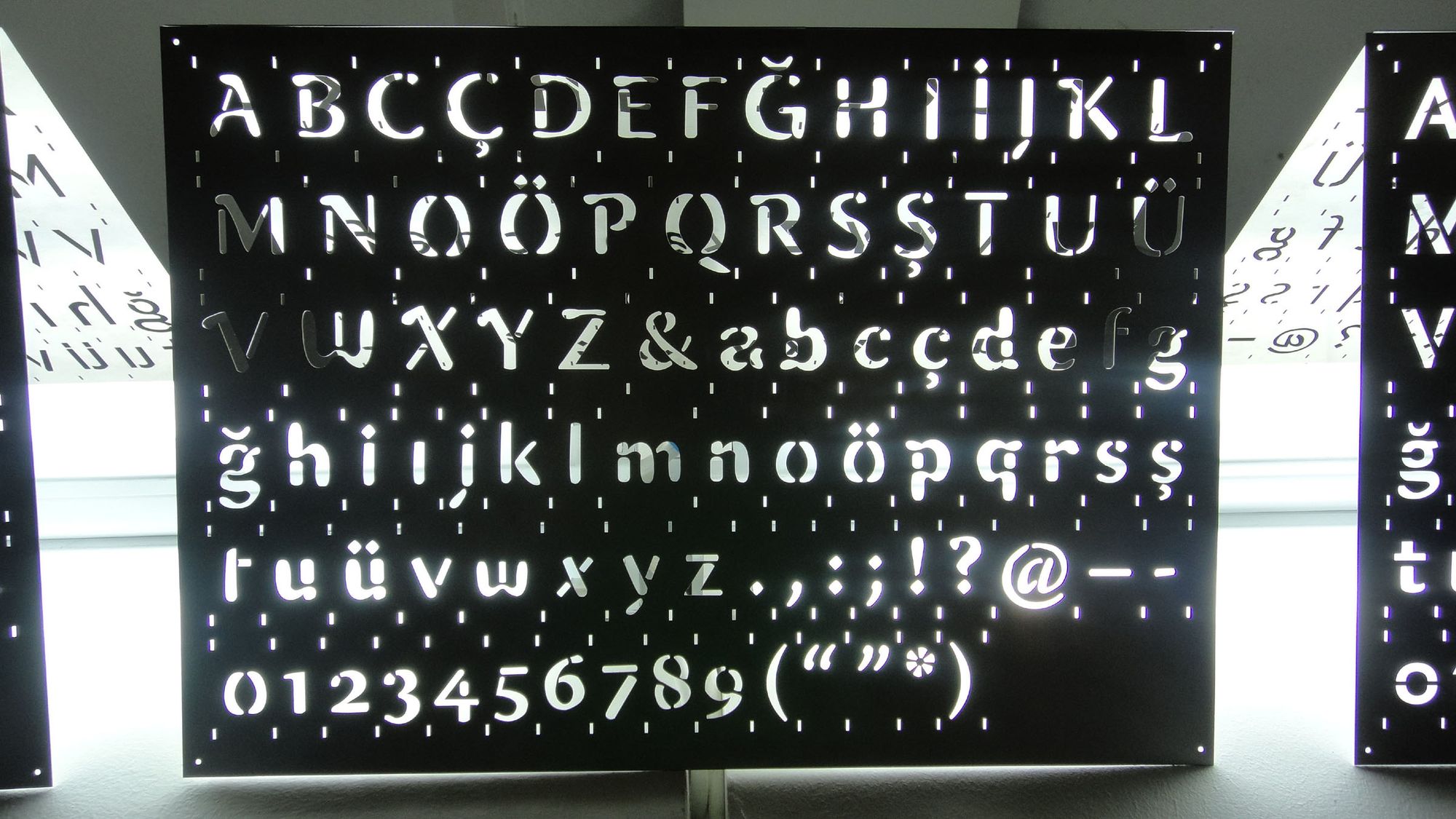
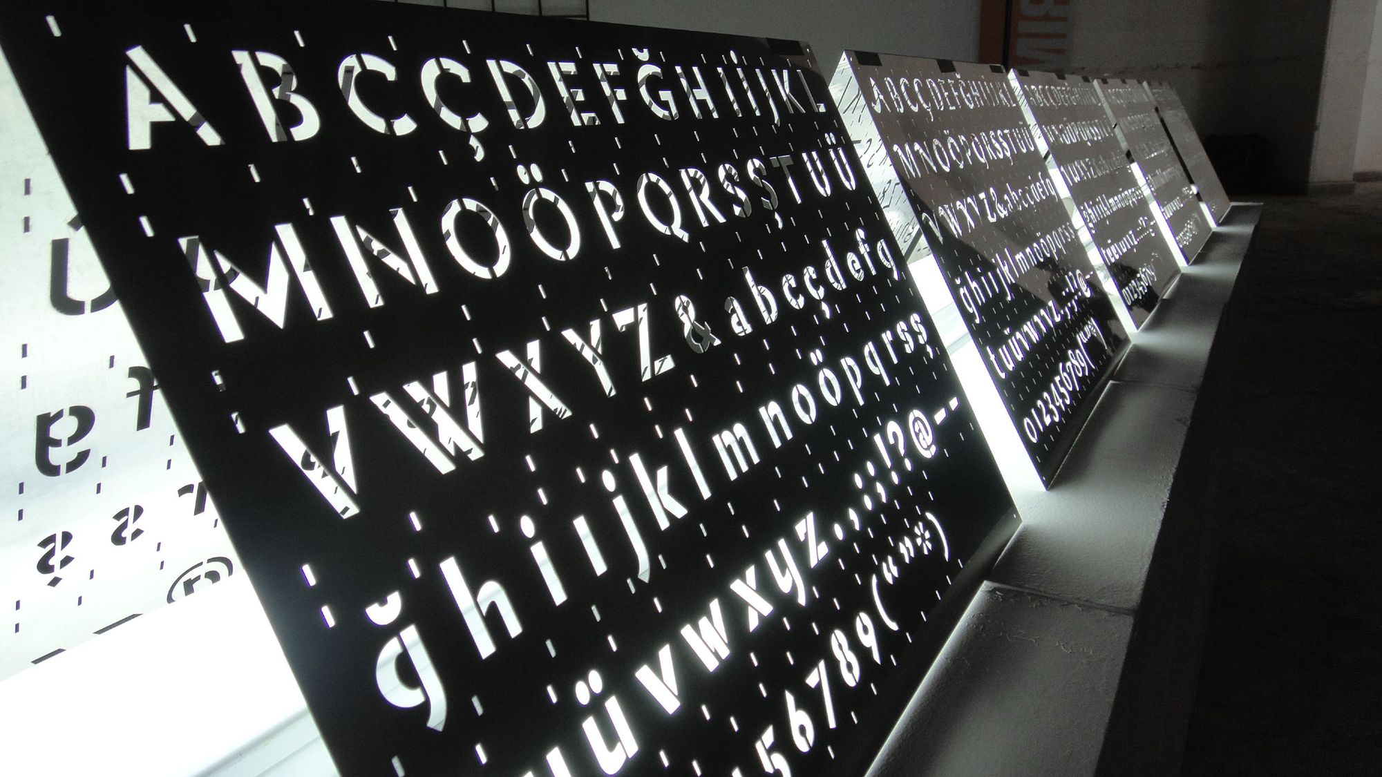
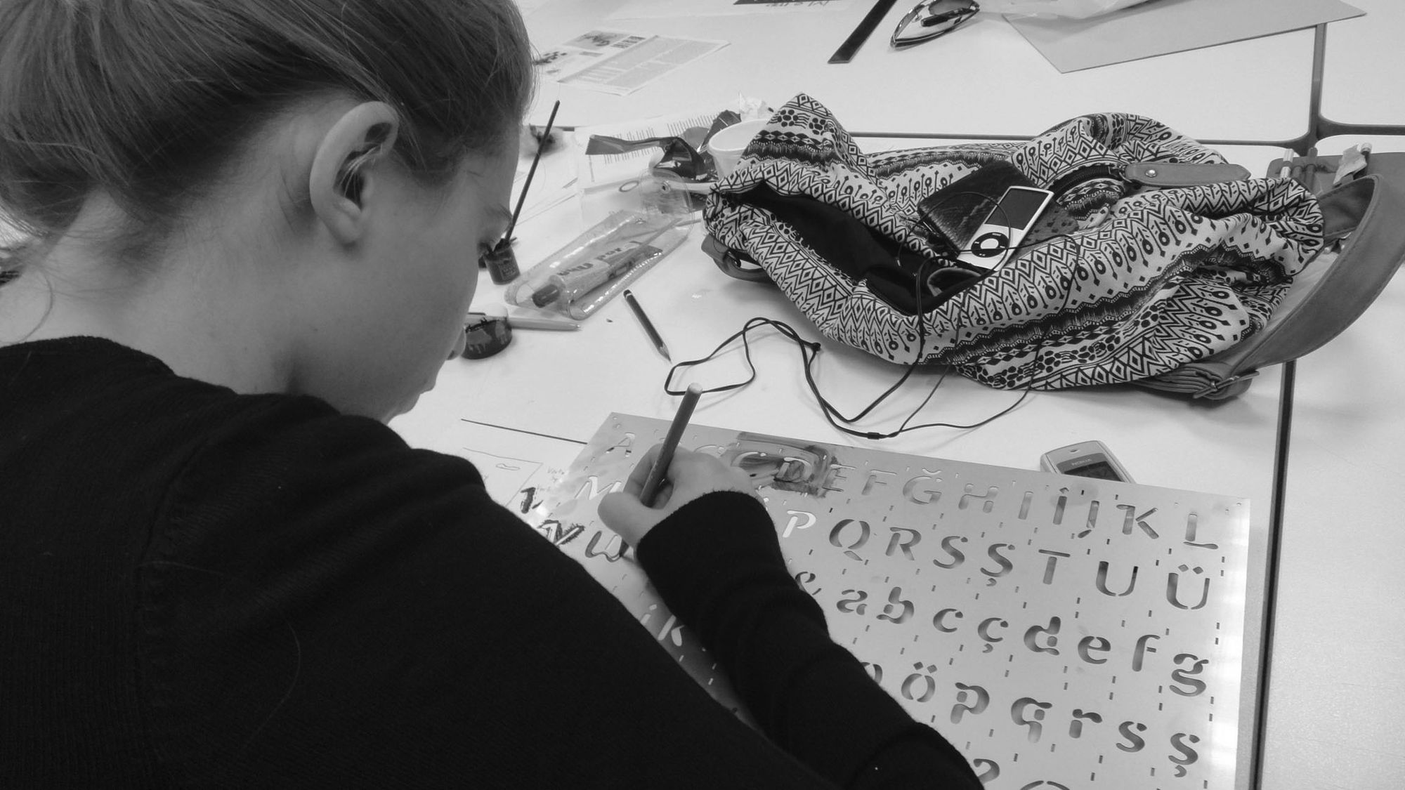
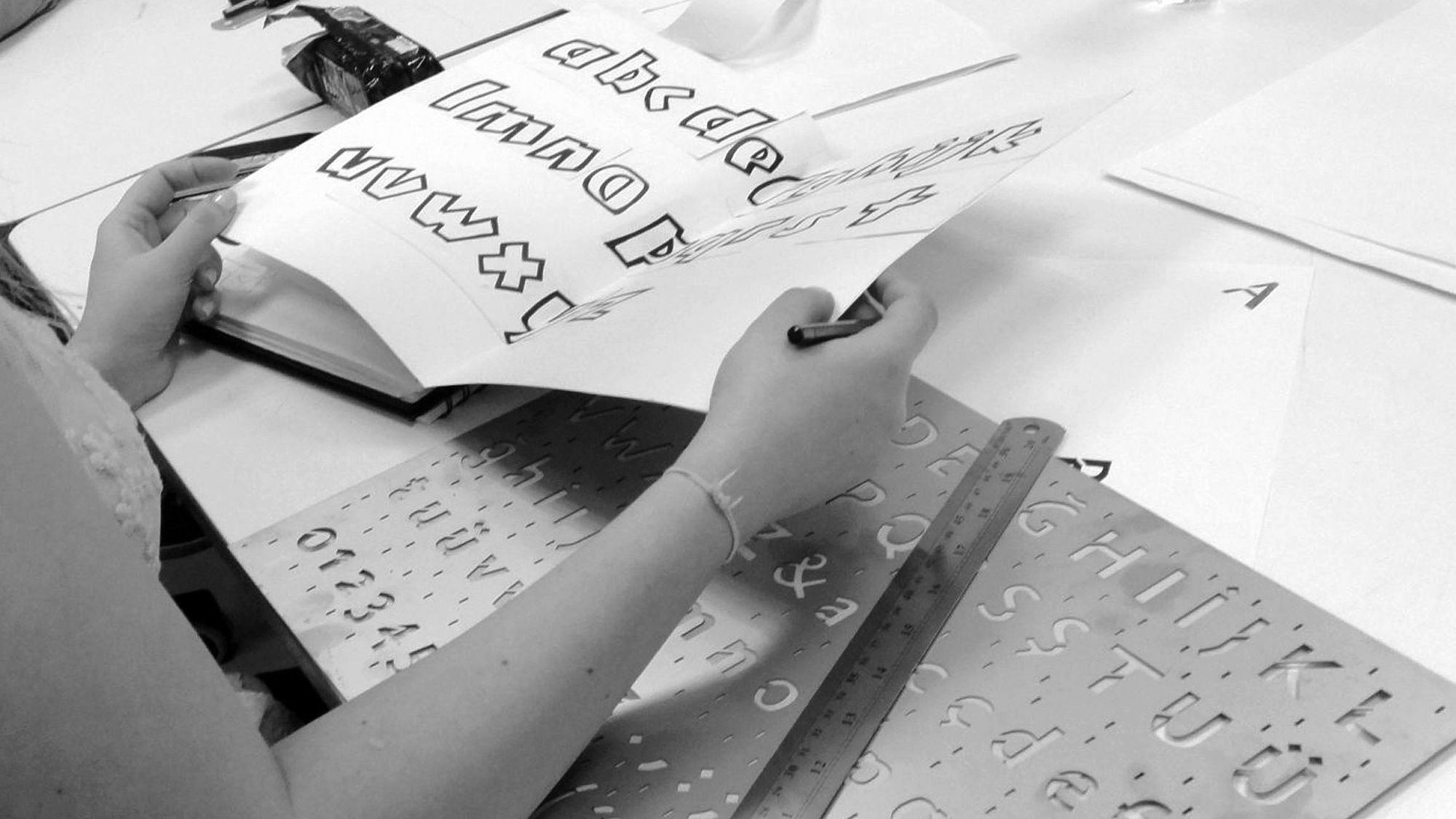
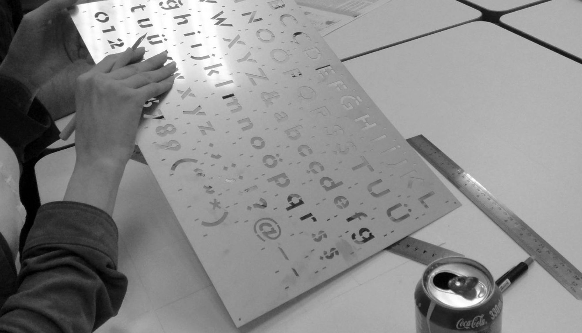
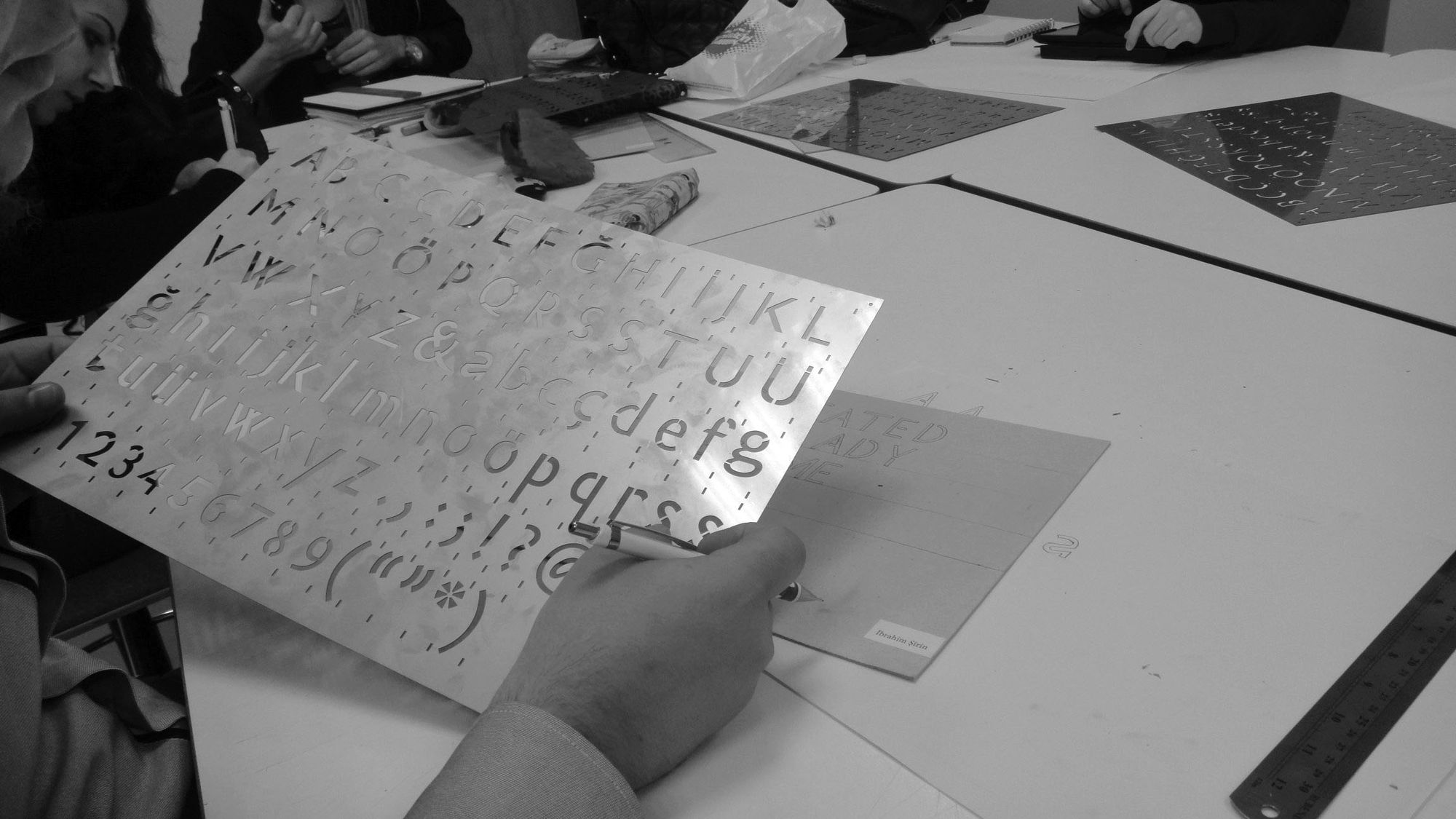
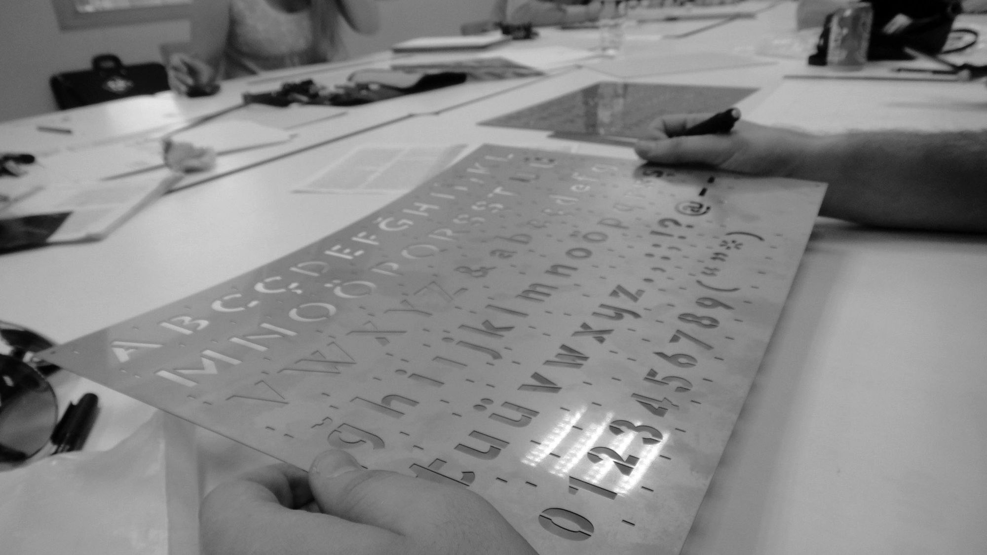
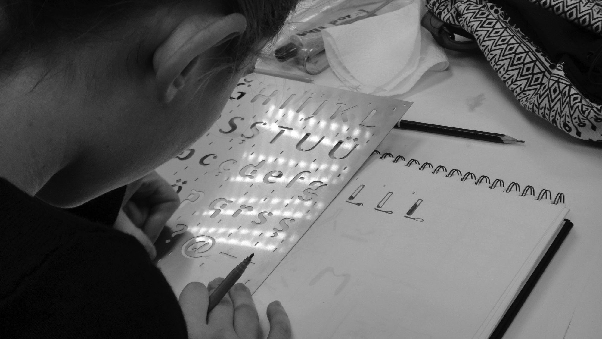
The task challenges students through multiple activities and a formal workshop: first, to draw a sans serif typeface starting from a given serif (Warnock® Semibold); second, to deconstruct the creation to make a tool usable to design new type; third, to laser-cut the final stencil typeface A3 (42×29.7cm) specimen into a 0.25mm stainless steel foil. The laser cutter machine on the students’ artworks stresses the concept of “imperfection” of the outline – being the cut something as accurate [to the drawing] and perfect as a stroke that has no thickness. The final stencil letter specimens are perfectly imperfect. The project was exhibited at the 1st Istanbul Design Biennial, October 2012.
Material: Tracing paper, pencil, Adobe Illustrator, thick acetate films, stainless steel, industrial metal laser cutter.
“The first attempt to design a sans based on a seriffed typeface was undertaken by the Dutch type designer Jan van Krimpen. In the early 1930s he designed the seriffed Romulus, totally with a sans serif design.”
—Martin Majoor, 11/2004
“In drawing/designing letterforms stenciling is a kind of in-between technique. On one hand it is much more precise than writing, because written forms are always different from each other. Stenciling avoids that, in principle every shape stenciled from the same stencil is the same. This can be done in Illustrator as well, copy and paste. The good thing about stenciling is however that the students have to use their own hands and are confronted with their skills concerning precision in cutting and positioning and drawing letter-elements. Using pens, pencils, markers, cutters instead of a keyboard, a mouse and a screen, results often in a total other mood and attitude towards basic exercises. So stenciling has a high degree of precision yet it remains very human, you have to do it with your own hands. The latin alphabet is very suitable for stenciling because a lot shapes repeat themselves, the curve from the ’n’ can be used for the ‘h’ and ‘m’ and ‘u’ for example.”
—Fred Smeijers, 02/2011