Student work
Alphabet City

Multiple students
ARCH 202 (Architecture 2) & CD 204 (Typographic Design 2) #sophomore | 2007 | Turkey
The task challenges students to apply the historical and technical background of typography, use forma type terminology, and to develop an awareness of letterforms: their geometry, the space they command, and the space they create both within and between them.
The aim of the workshop “The Language of the Text” (February 7–19, 2007) was to mutually have Visual Communication students learn from their peers in Architecture, to foster knowledge and applied knowledge in a collaborative team-based environment.
The exercise was devised by me in collaboration with Architecture professors Gül Kaçmaz Erk and Selma Göker to encourage a thoughtful application of typefaces and letters; to emphasize the importance of an appropriate choice and application of typefaces and graphical expressions, and to experiment with given forms to create negative and positive spaces.
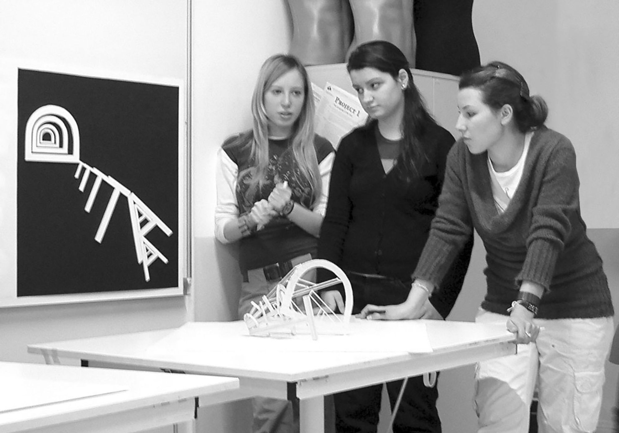
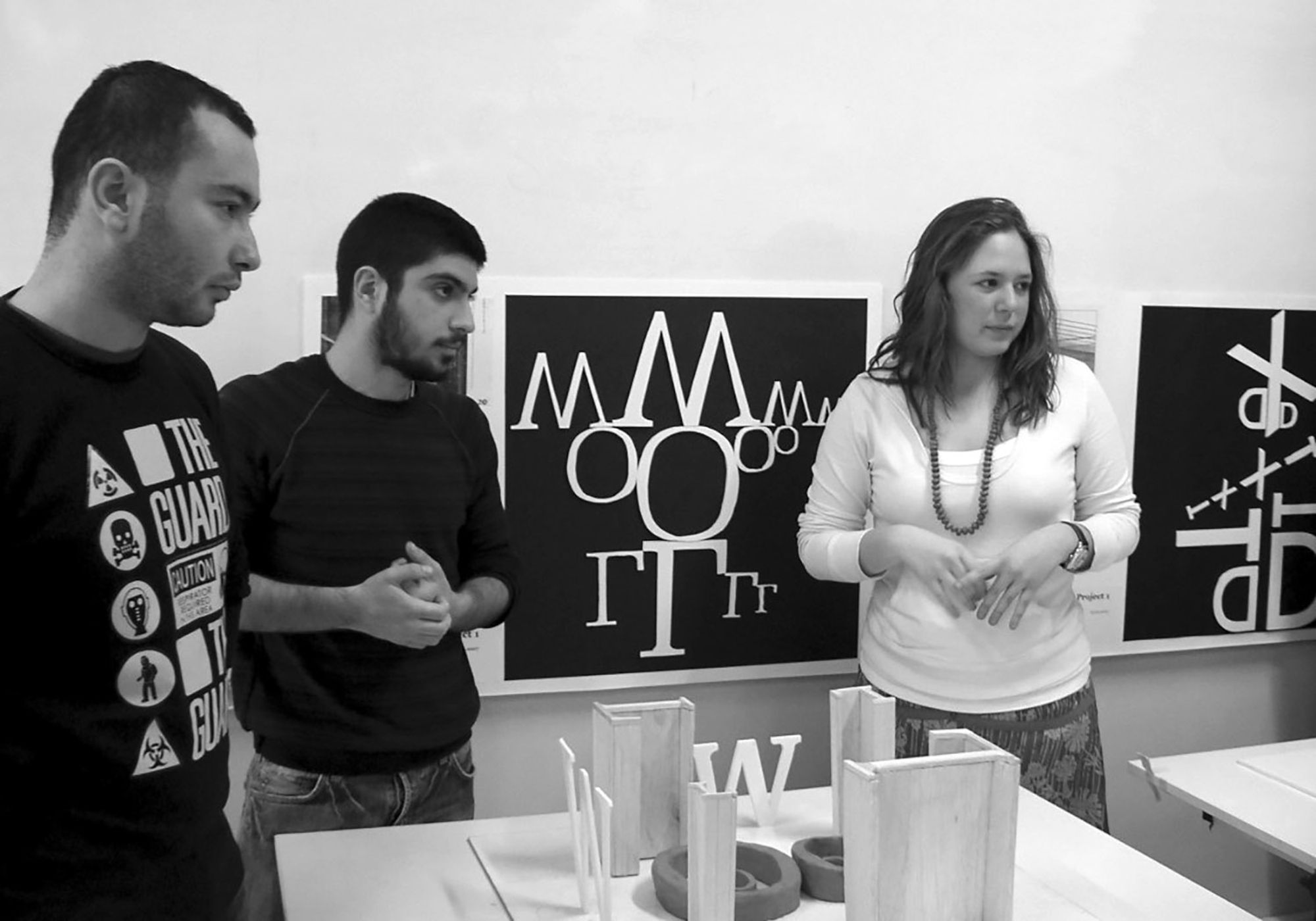
The process saw five main steps in three meeting sessions:
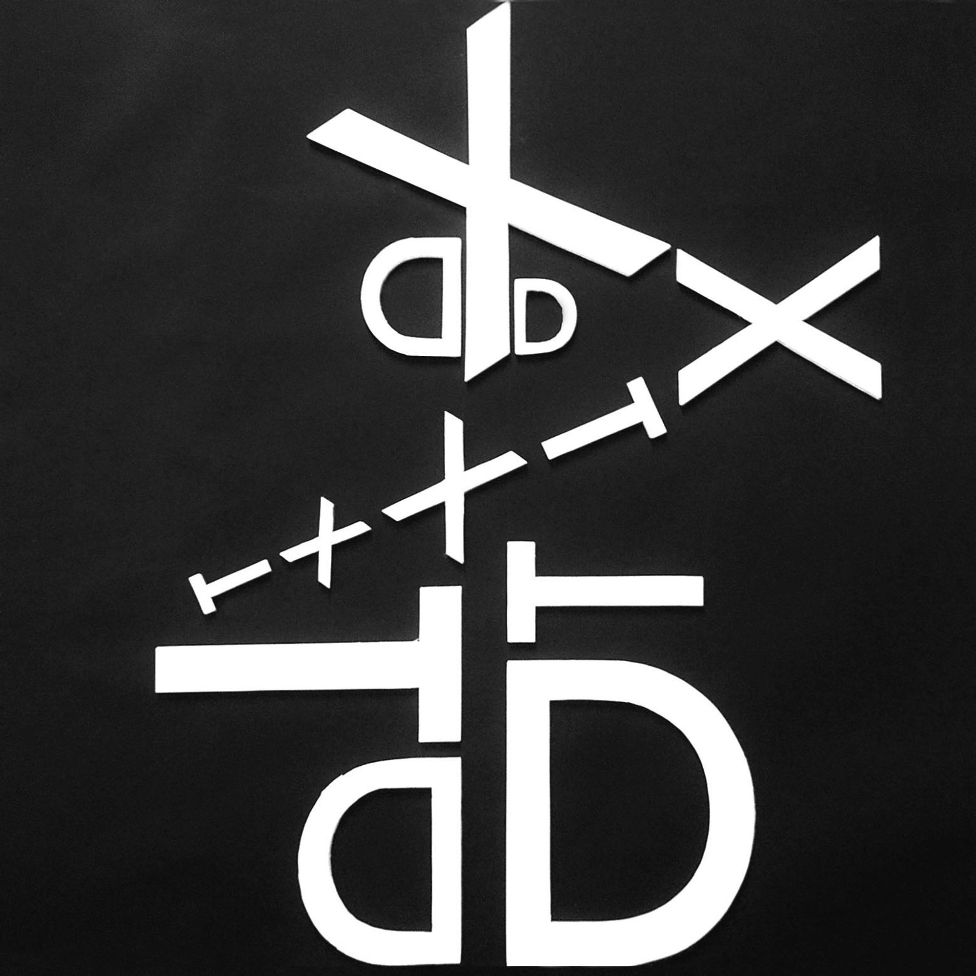
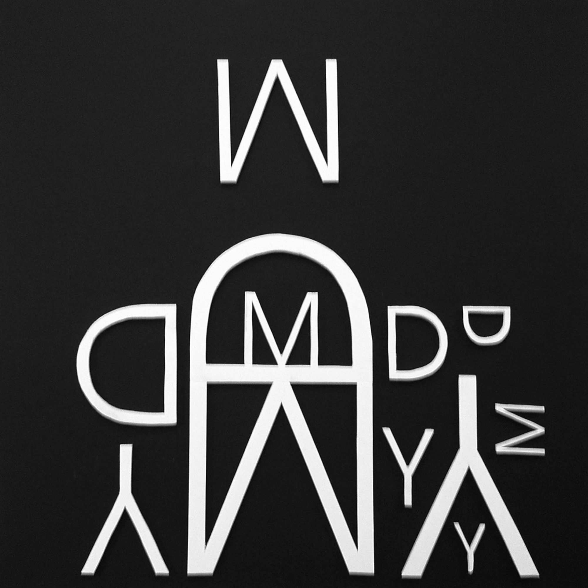
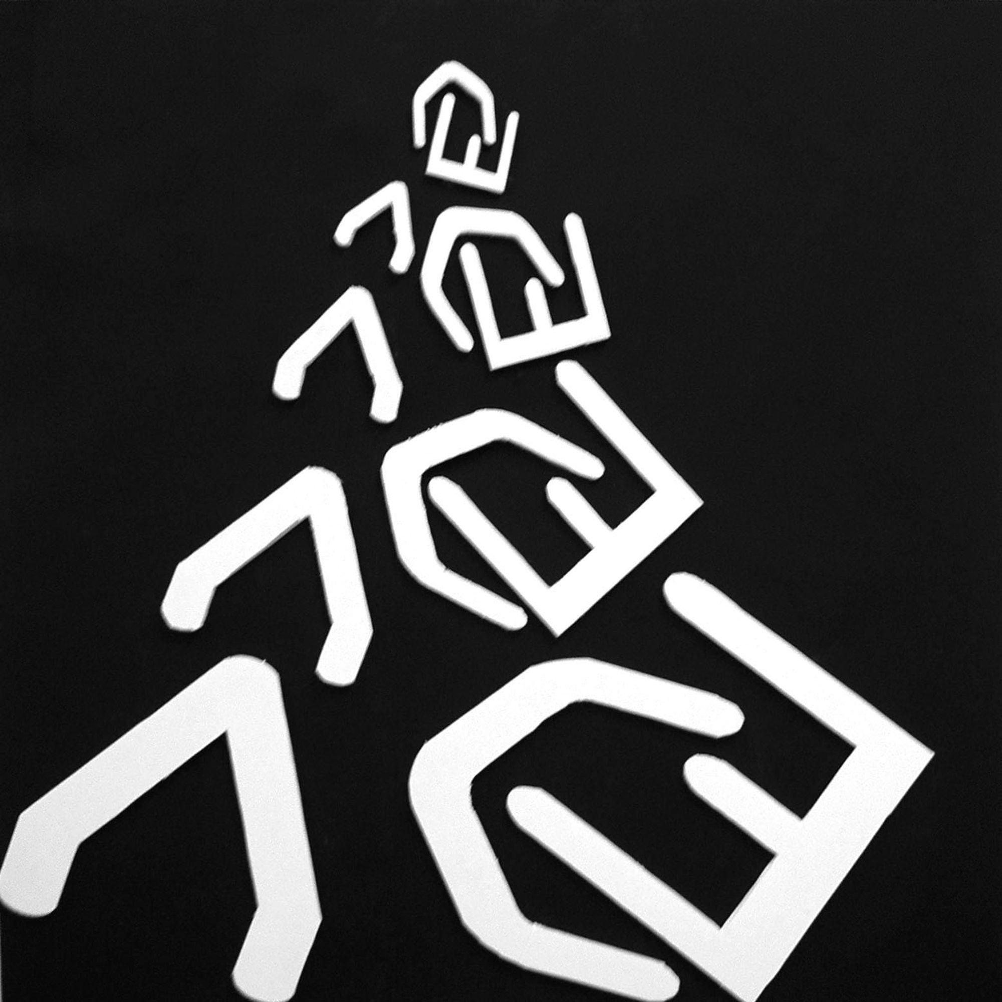
1. Consider an historical/æsthetic logic path leading to the choice of one upper case specimen (type character sample) for the chosen photograph of a famous architecture.
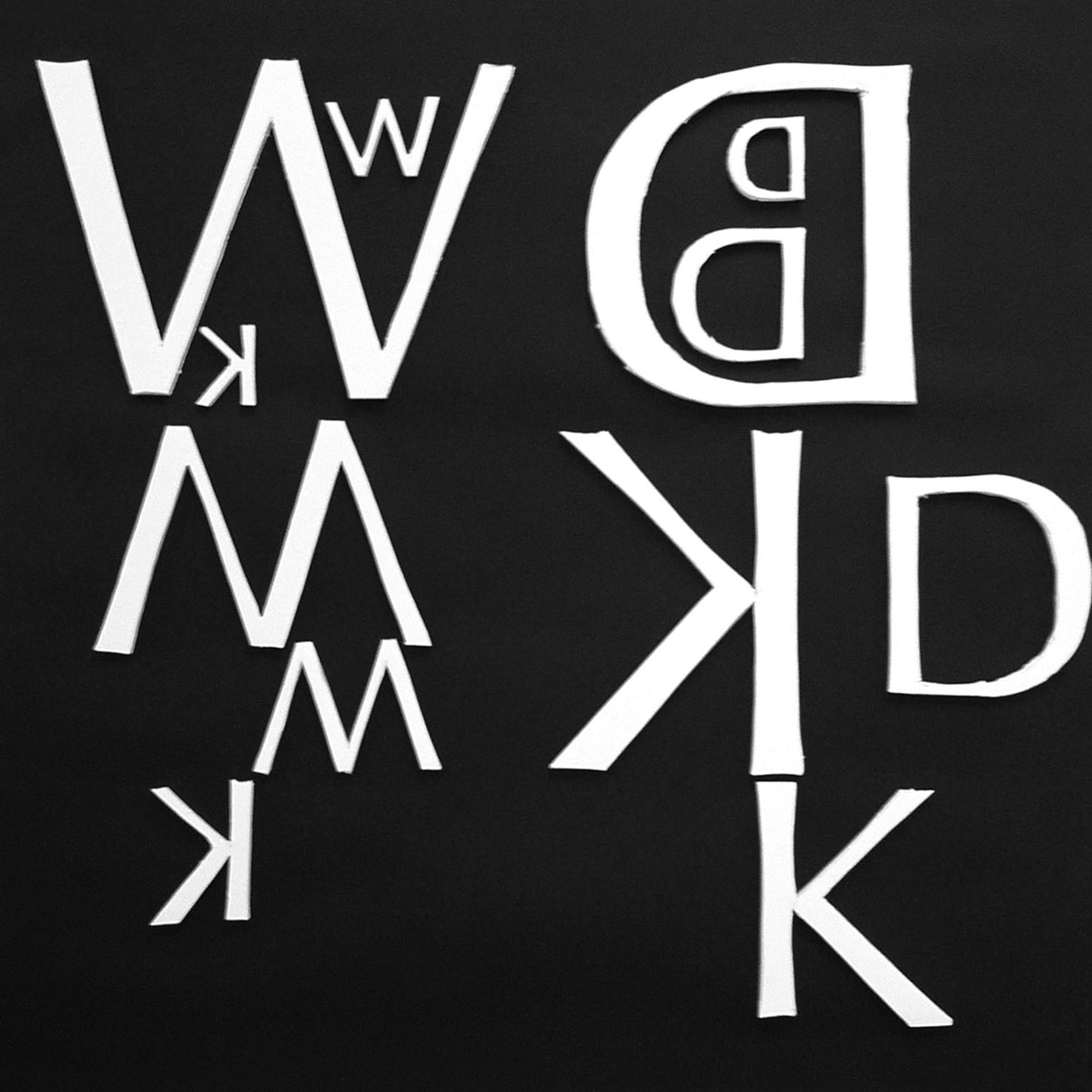
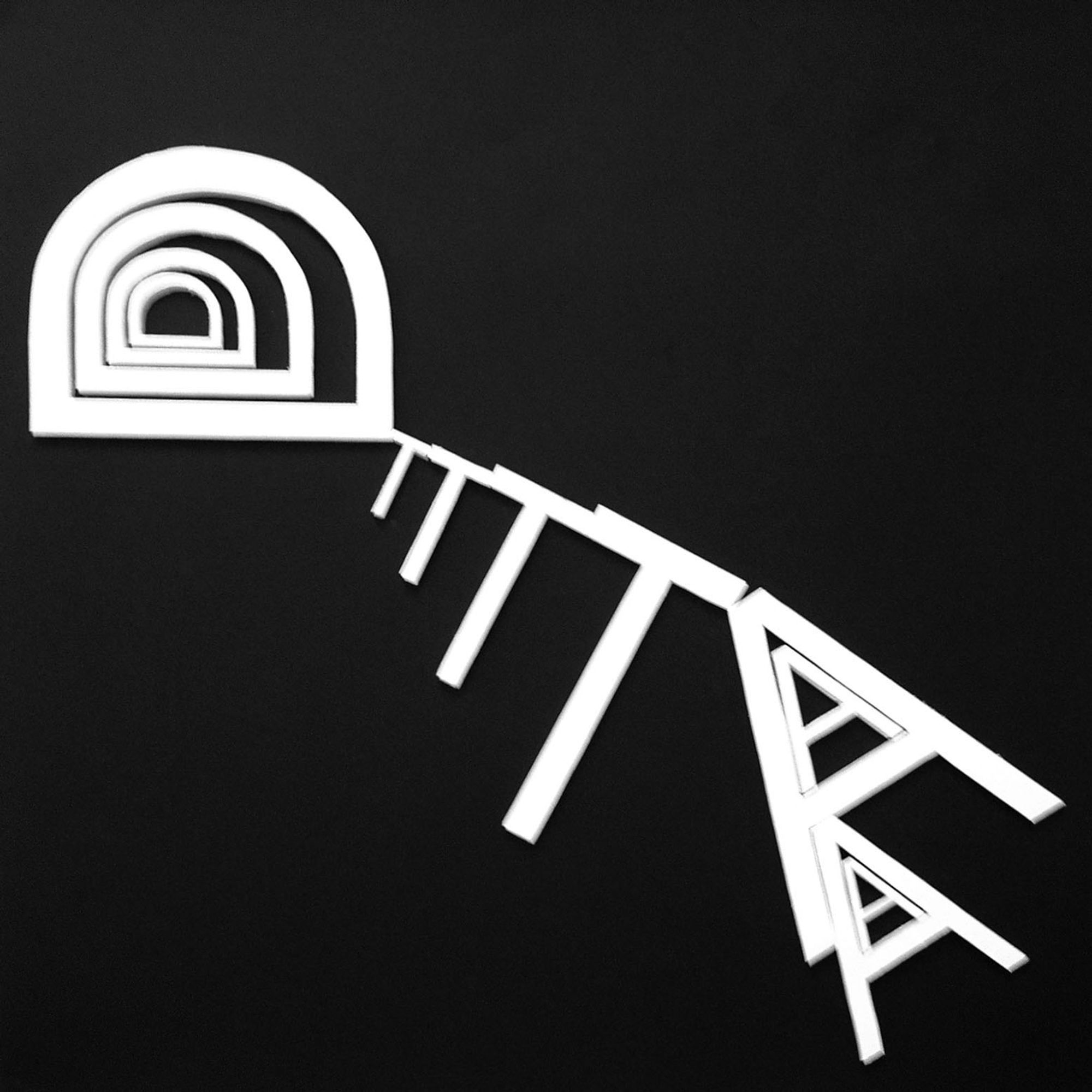
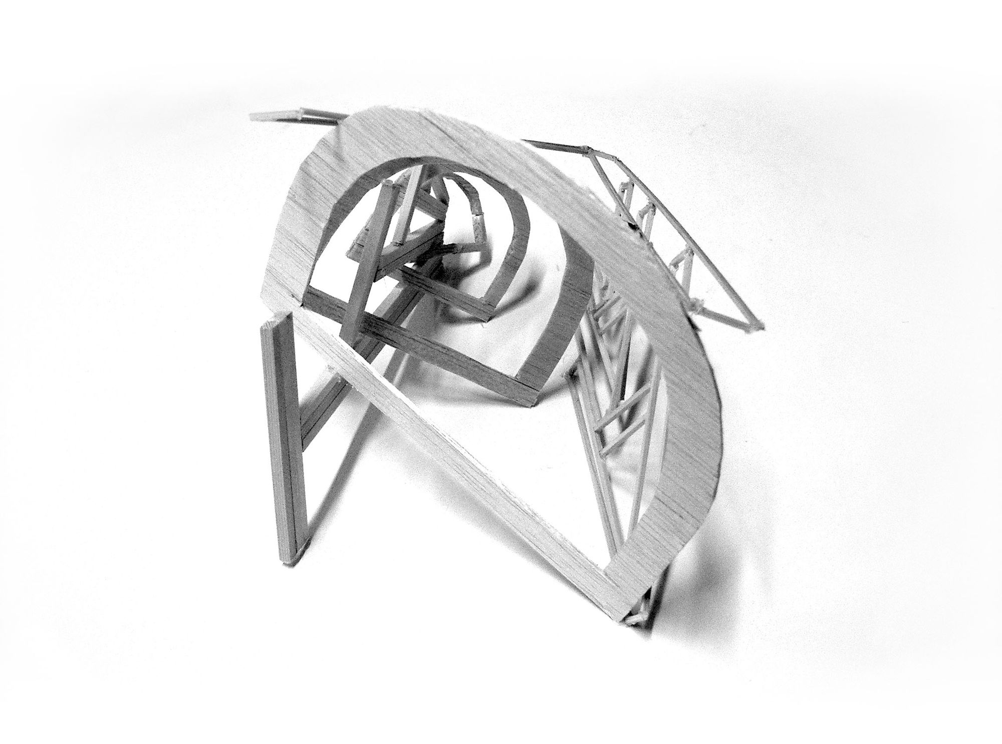
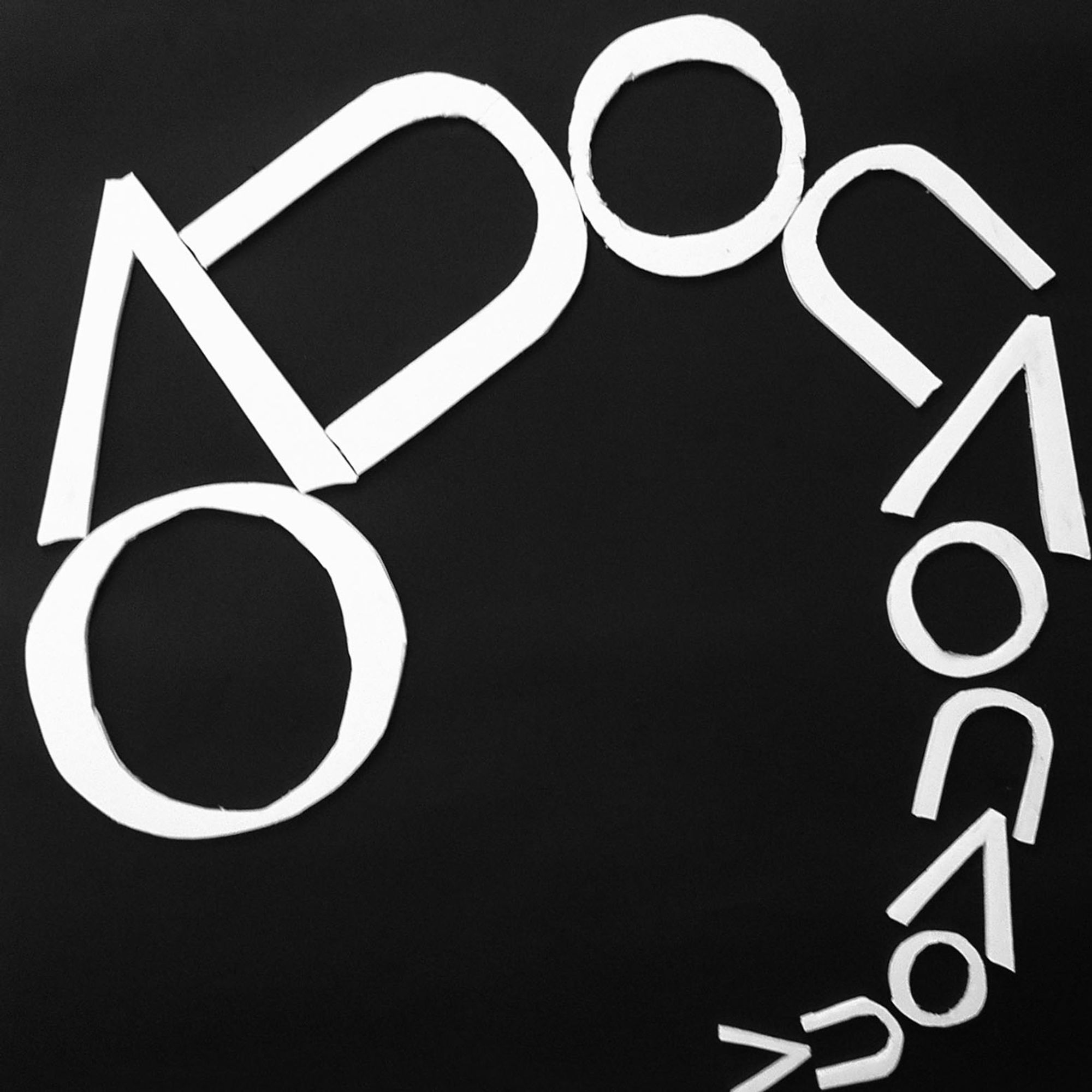
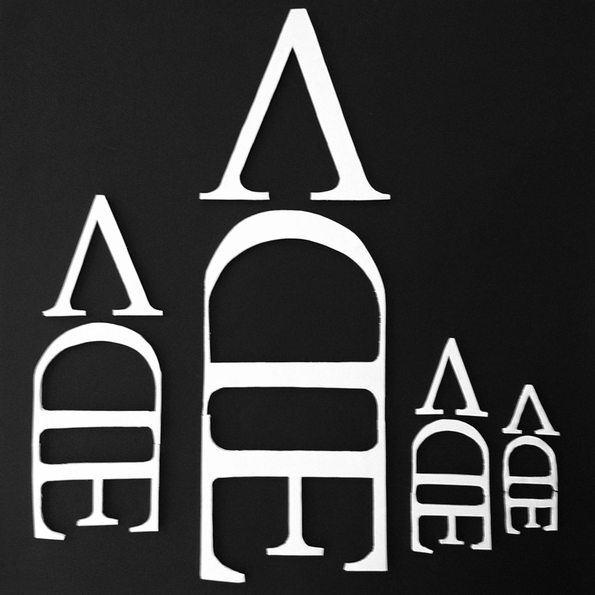
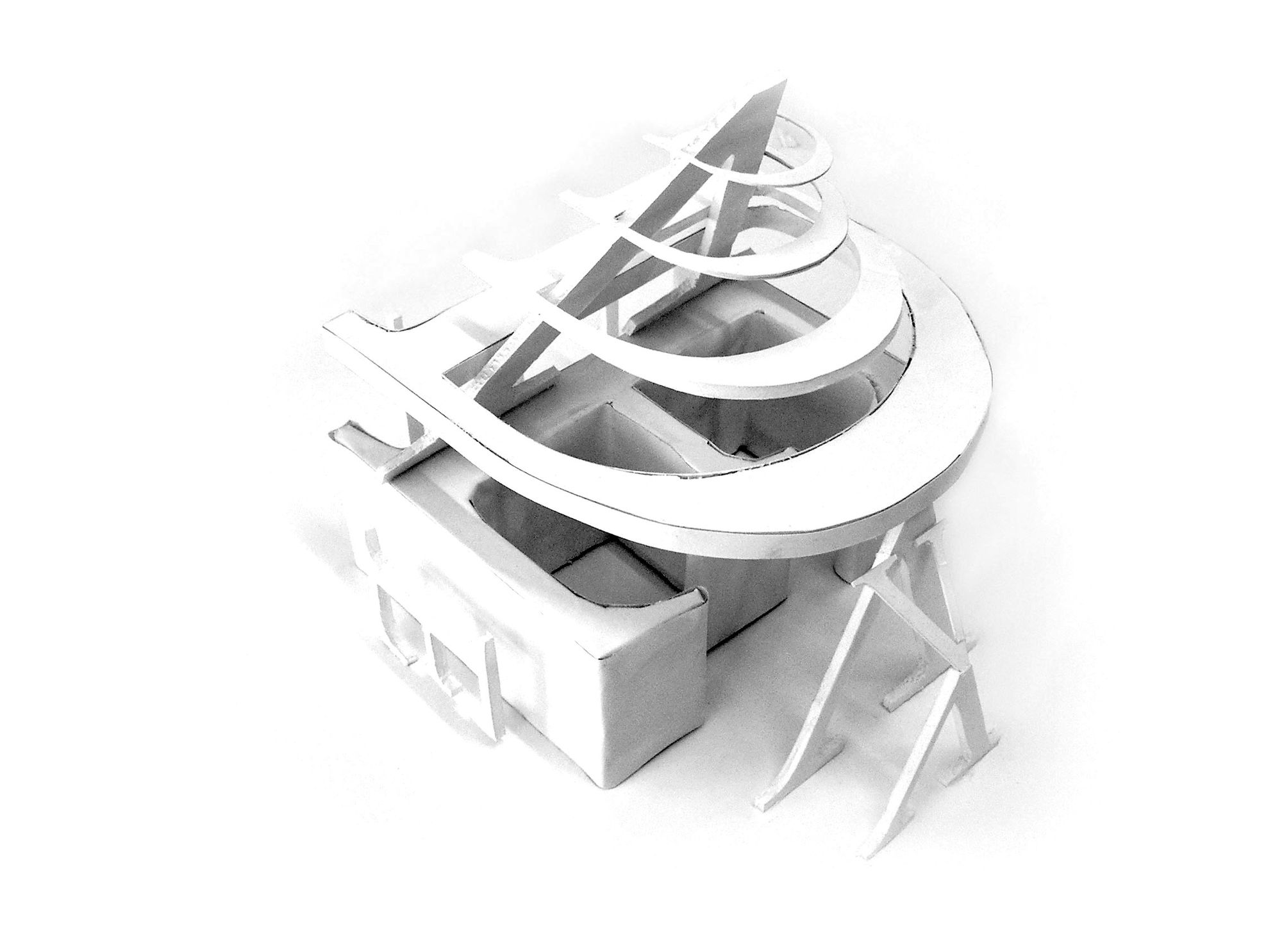
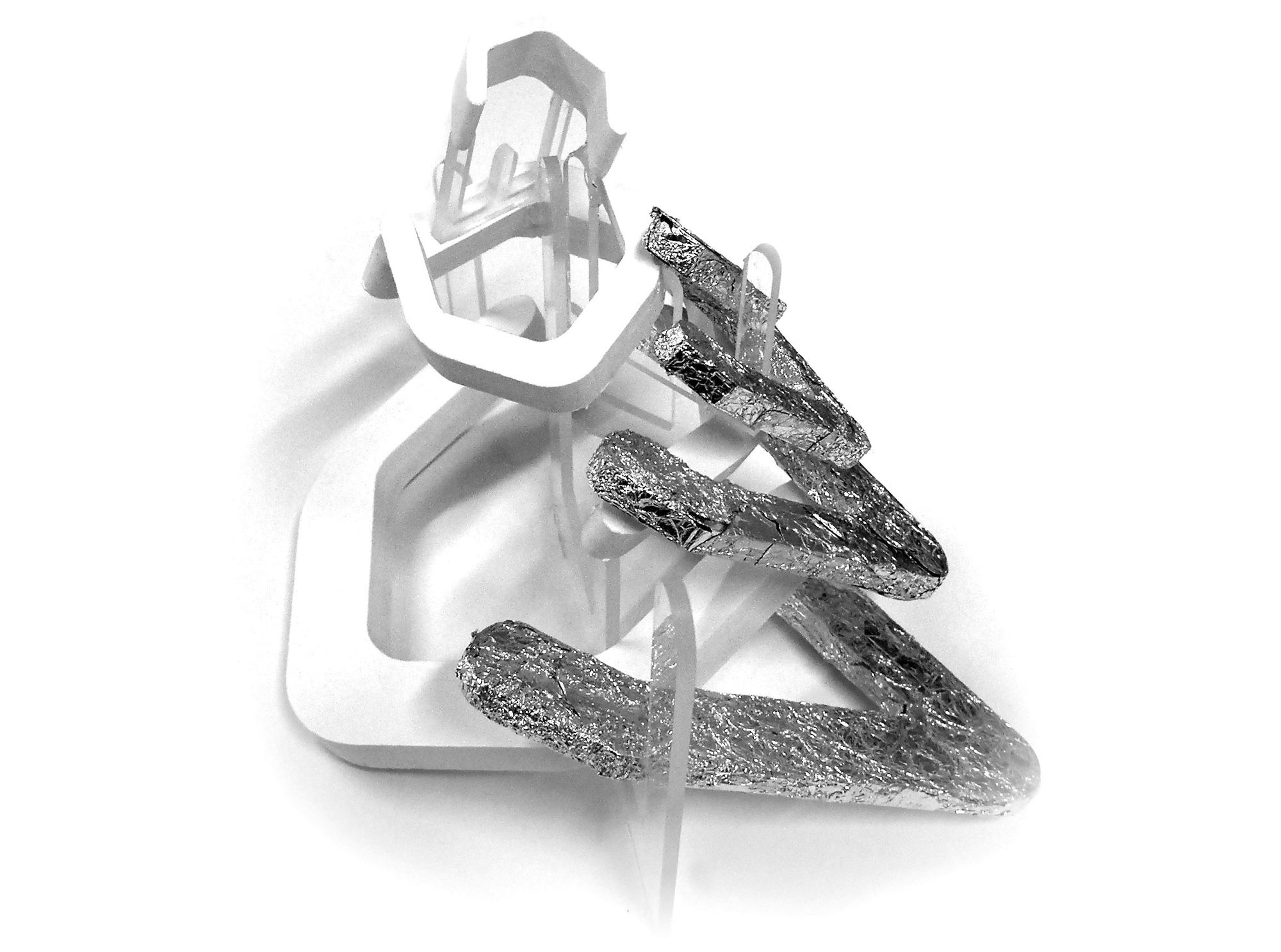
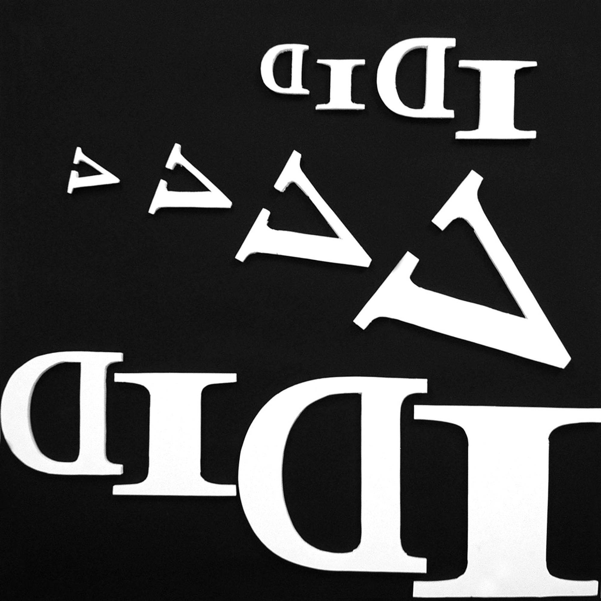
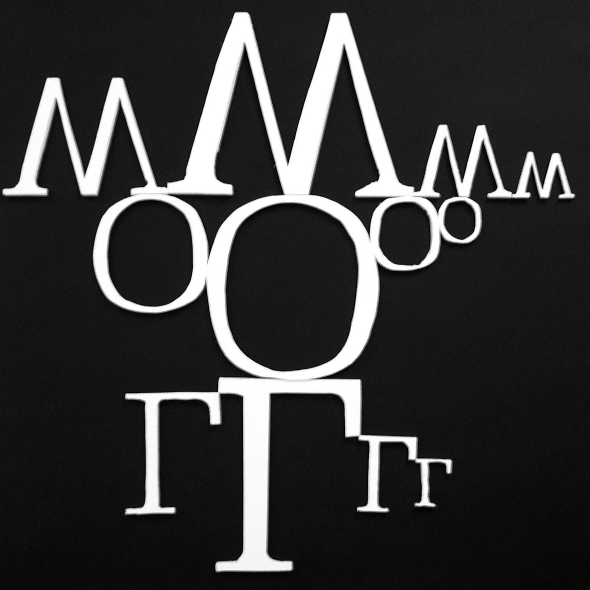
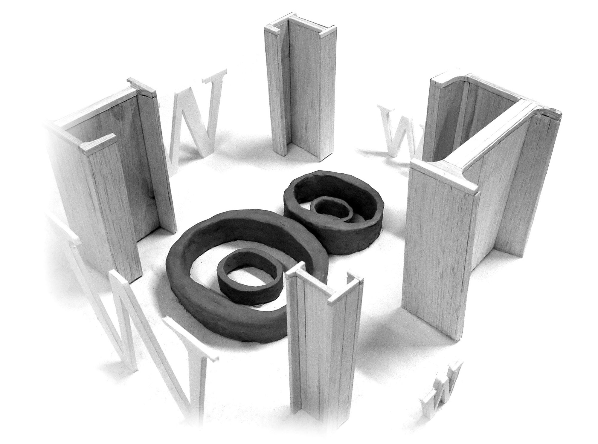
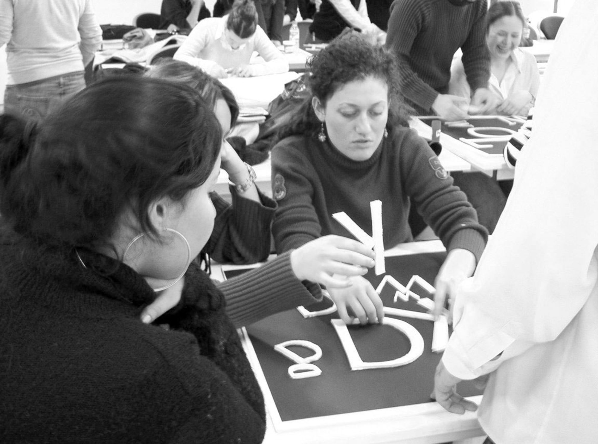
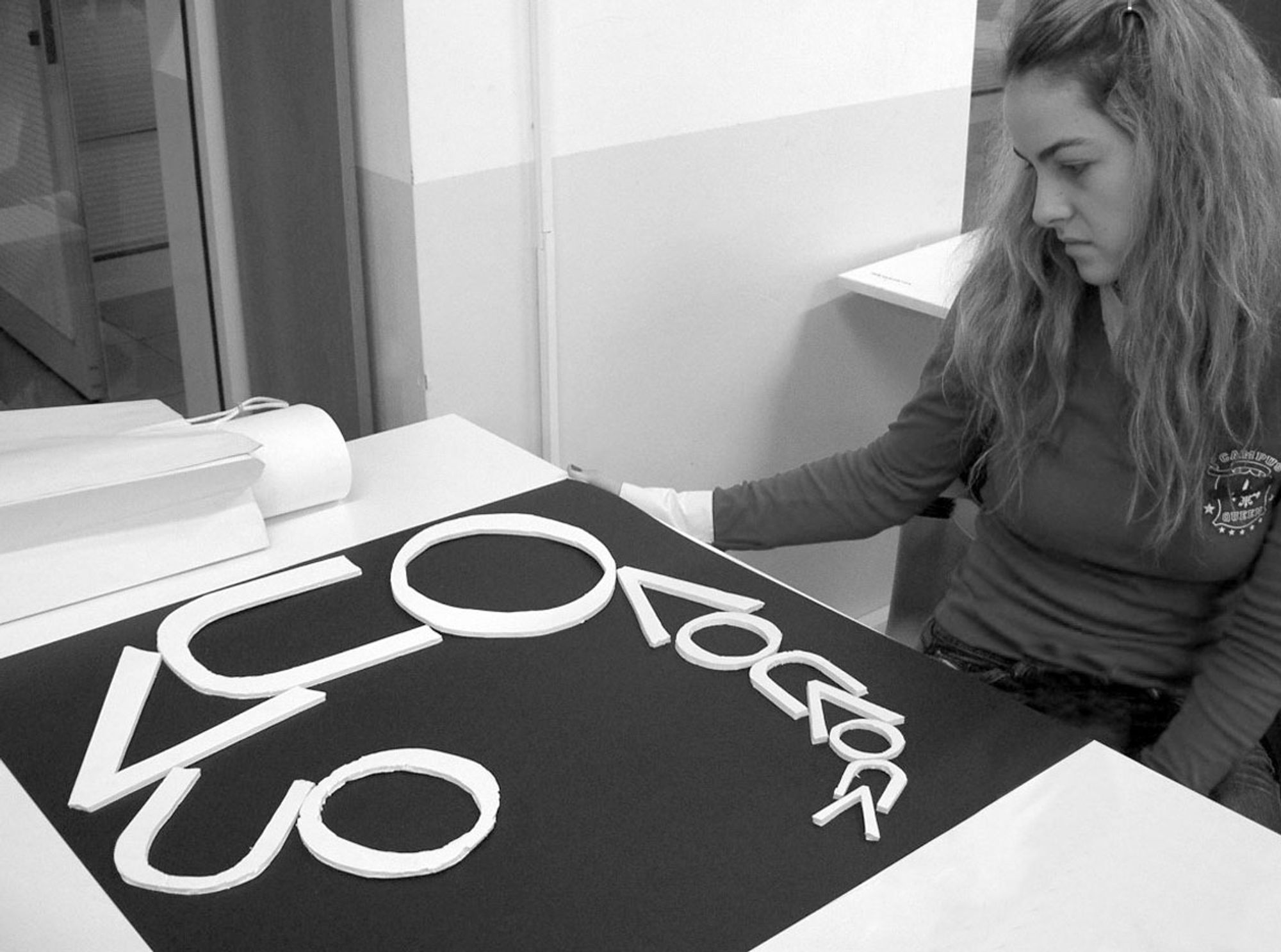
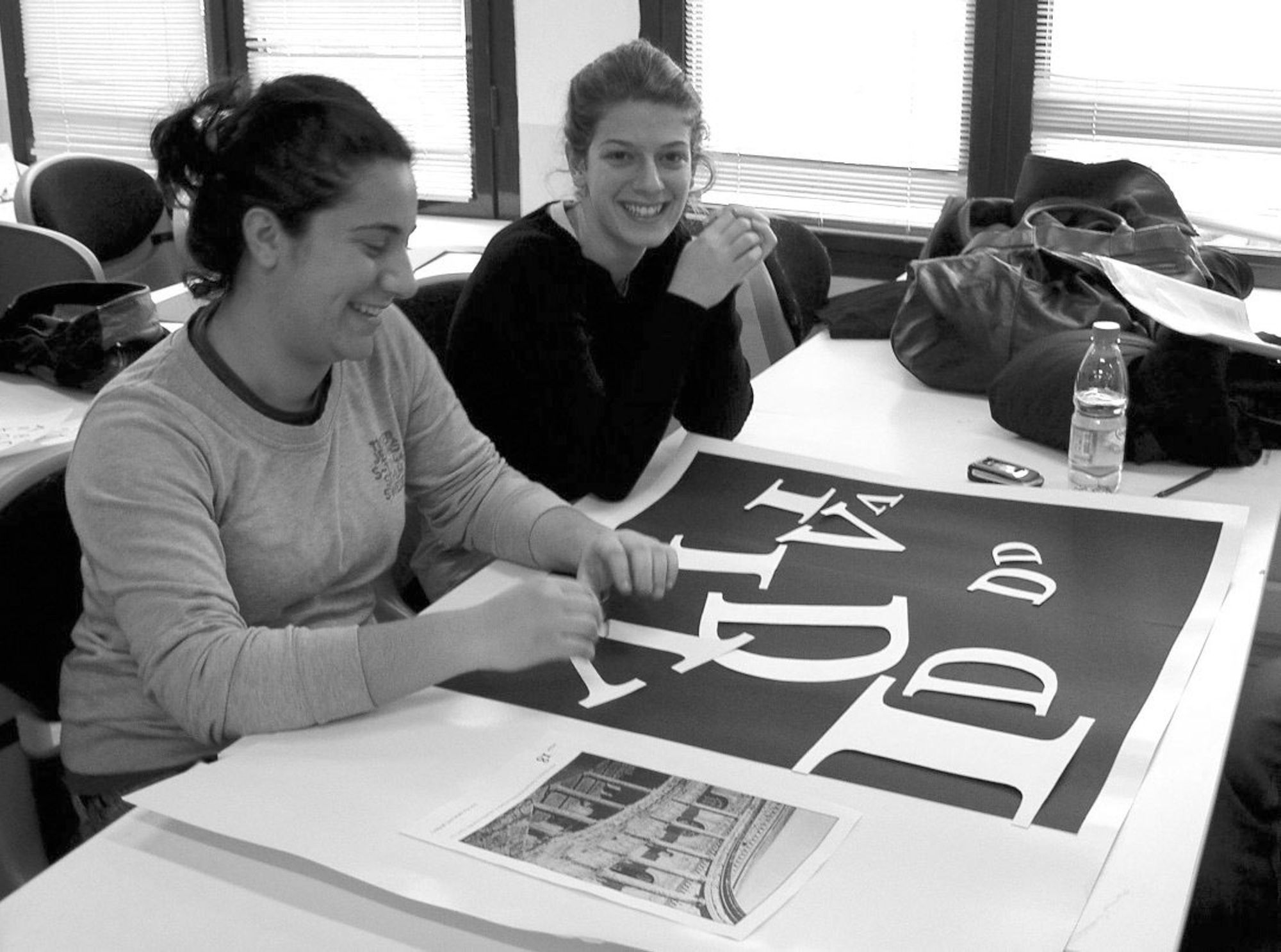
2. Select one letter from each of the three basic shape groups (square, triangle, circle) and cut on foam board a series of four incremental sizes in order to have a set of 12 letters (objects).
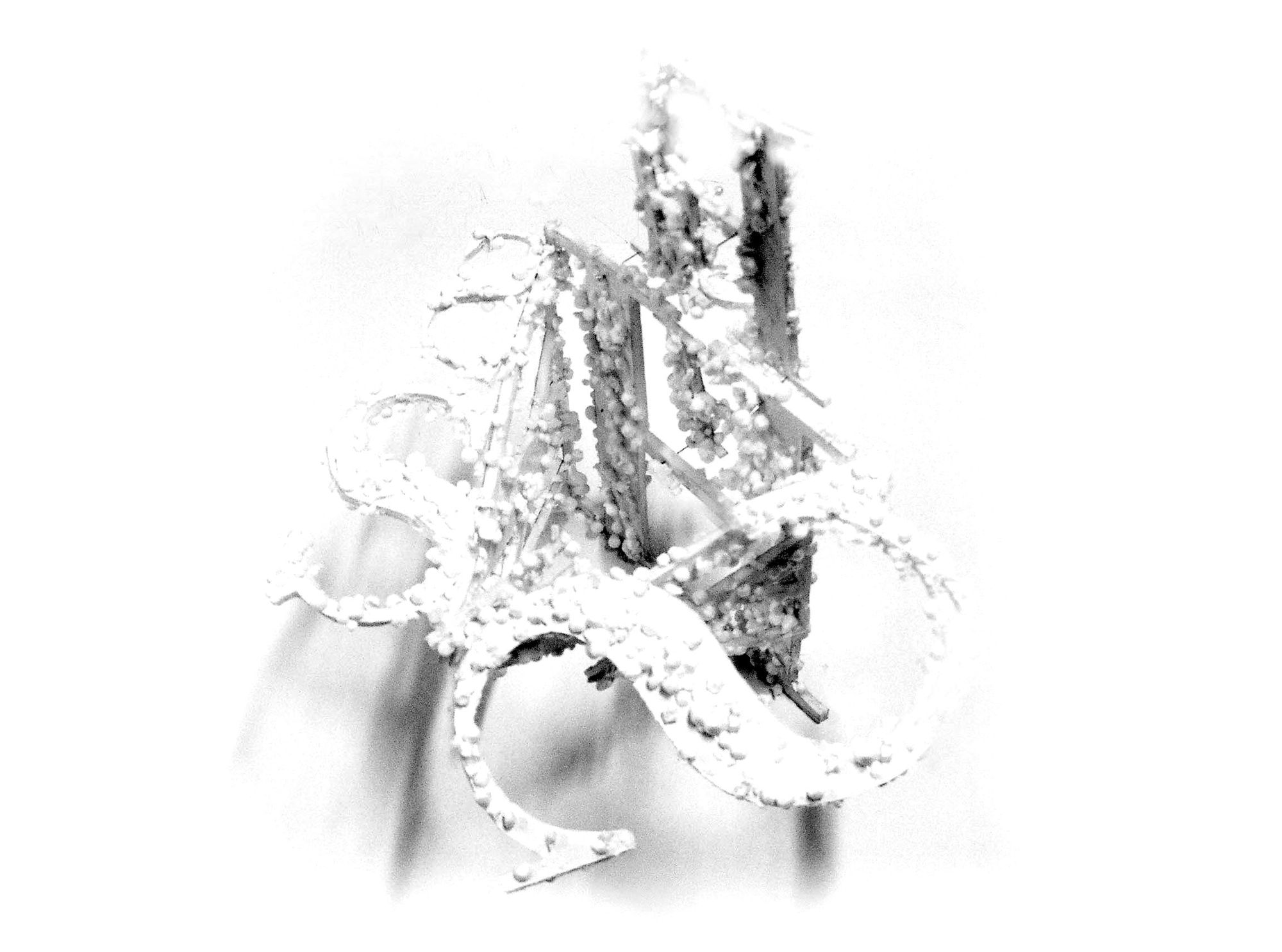
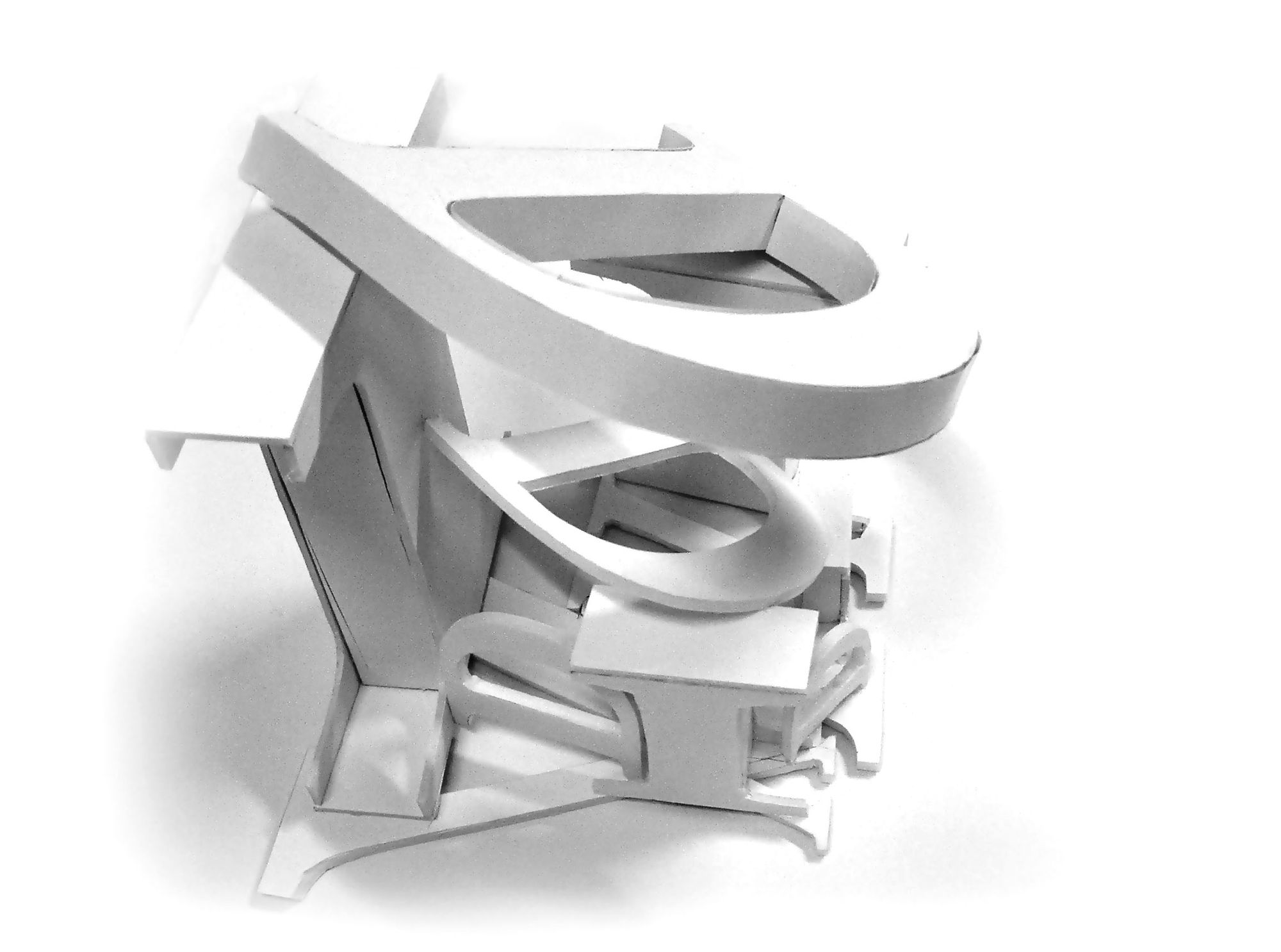
3. From a structural and emotional analysis of the starting photograph, make decisions about how typed or mechanically reproduced letters can be used to portray a certain image.
4. Define constraints (specs) for the presentation design, supported by two lectures: “Why the way we write, organize a text or a page are all paramount to the presentation of ideas,” and “Architectural drawings and text.”
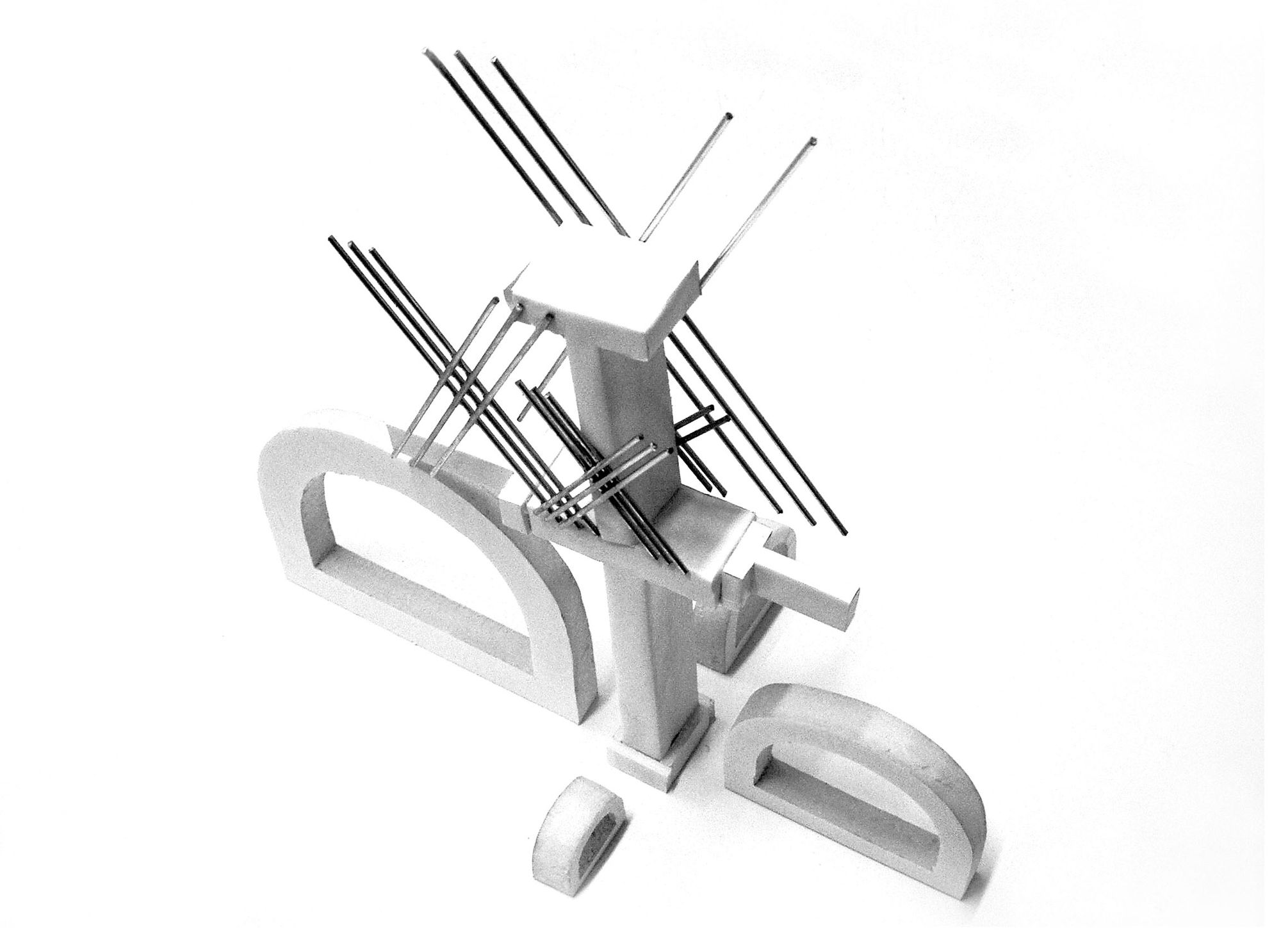
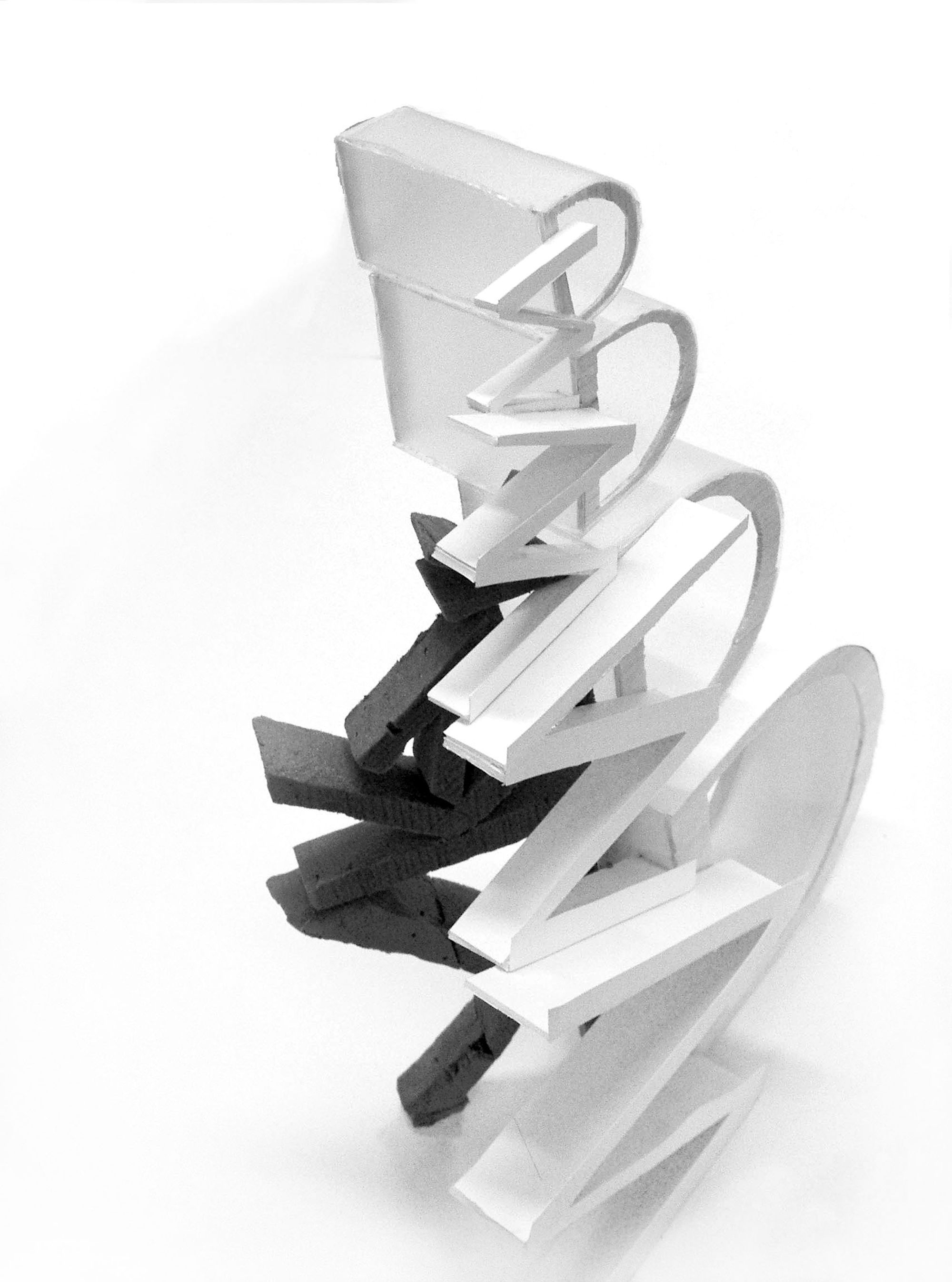
5. Using the same 3 letters in their 4 size cuts, design an enclosed space that is a three-dimensional translation of the chosen image, using any appropriate material.
Material: Foam-board, exacto-knife, basic architecture modeling tools, digital printer, various materials.
A review:
I think it is of immense importance to get students thinking about type beyond the printed page; when removed from this familiar medium and viewed independently of such overt, distracting elements as color, photographs and illustrations, I believe students begin to see type less as a prosaic afterthought and more as the versatile, expressive artistic device it can be. The versatility of type as a design element is highlighted particularly well by this project. The workshop also gets students thinking about the structure of letterforms: each letter becomes a work of art to be carefully considered for its “architectural” merits. This can help create a real appreciation and respect for type designers.
Leila Singleton, 3/1/2007