Projects
Contra Mundum
Contra Mundum
Logo & Identity

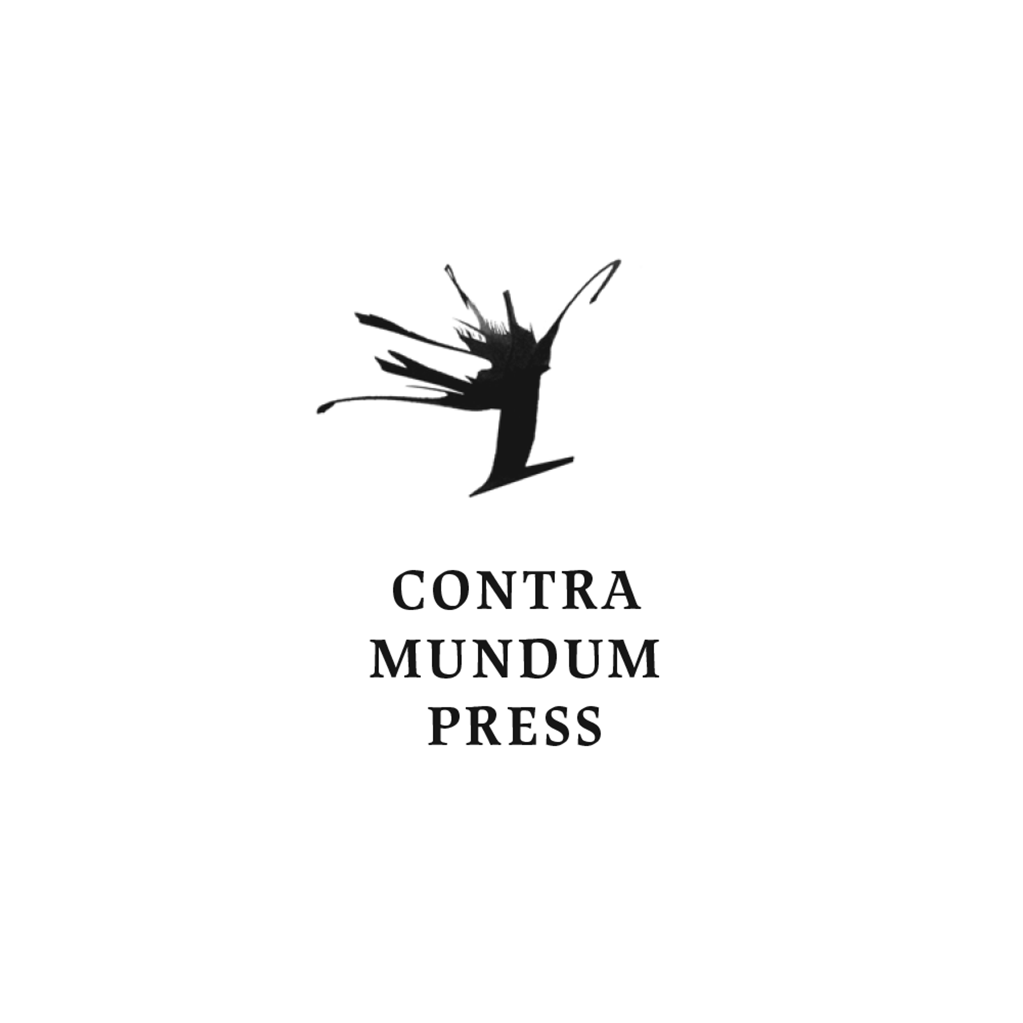
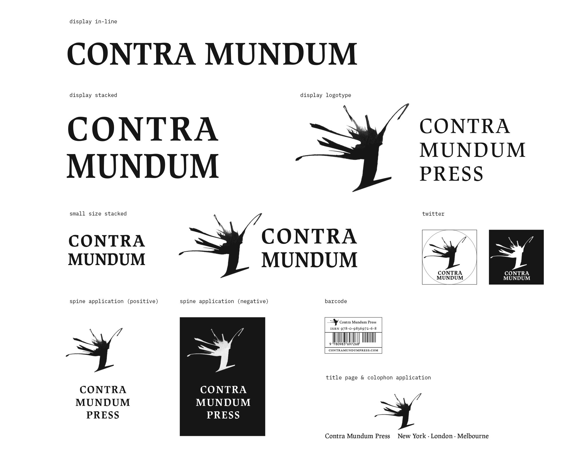
The design of the logo and visual identity for Contra Mundum saw three main updates since my first version from 2012. The primary aim of Contra Mundum is to publish translations of writers who in their use of form and style are à rebours, or who deviate significantly from more programmatic and spurious forms of experimentation. The press is dedicated to the value and the indispensable importance of the individual voice, to testing the boundaries of thought and experience. The visual concept of the symbol part of the logo comes from discussing with publisher Rainer J. Hanshe the idea of wind blowing and the starkness of a strong tree. Another quality we wanted imbue was sharpness. The mark was drafted in a few energetic fast & controlled strokes. The typographic part of the logo has been a process of slow transformation and perfection. The present version of the logo instances are set in two main weights of Tim Ahrens’ Lapture. A unique feature of this typeface is the introduction of blackletter characteristics into a roman anatomical structure, angular stroke segments, and sharp serifs — it has the strength and boldness of the press name.
To improve the appearance of the necessary book barcodes, I designed the barcode element with the logo in it as well. This instance of the design still uses an older vector version of the mark, which works best at a small size, 4.5mm or 1 pica (such as in the barcode object).
The Hyperion logo was actually the first to be designed using Lapture. Hyperion: On the Future of Aesthetics, is a free online magazine published biannually and features essays, translations, interviews, and reviews. Hyperion is concerned with aesthetics, with the value of art and the ways in which it can be transformed and renewed. Read more here.
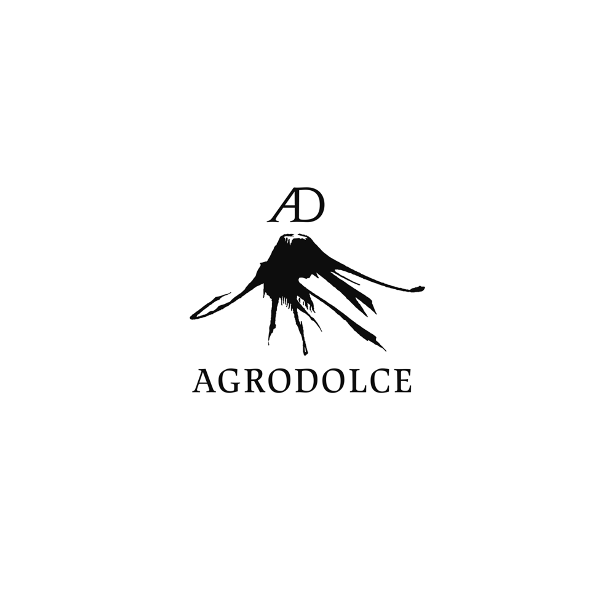
The version of the logo for Agrodolce — a series of unorthodox books on food — renders a matching volcano drawing by artist Federico Gori and a custom “AD” ligature. See the About page of the press website to read more about Agrodolce.
Material: Broad nib pen, black ink, Illustrator, InDesign.