Projects
ISType Conference Logo
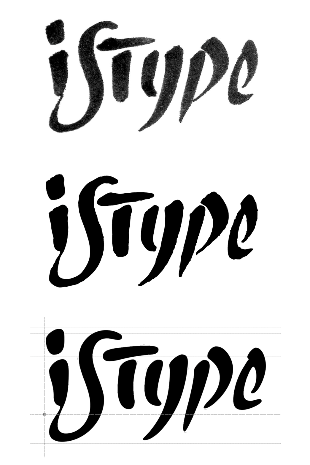
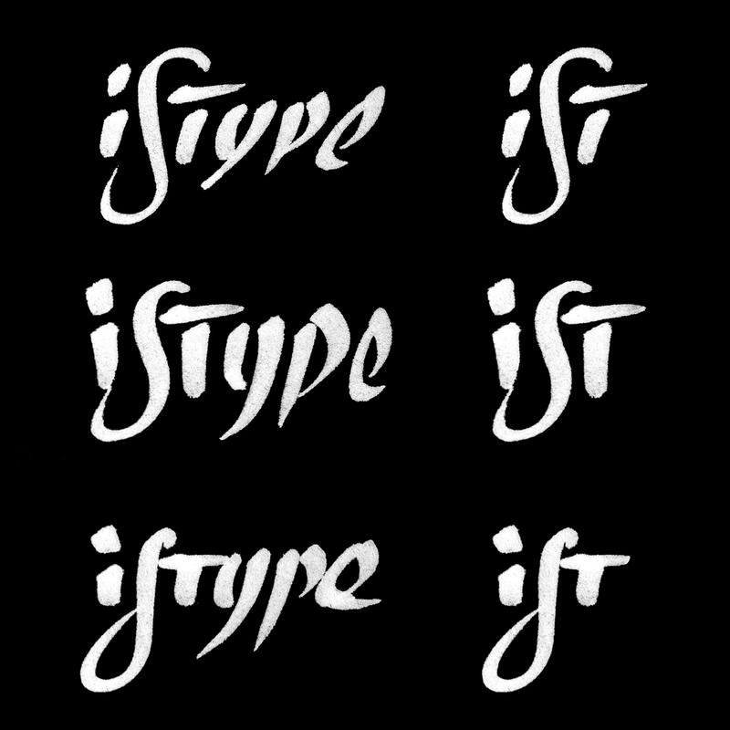
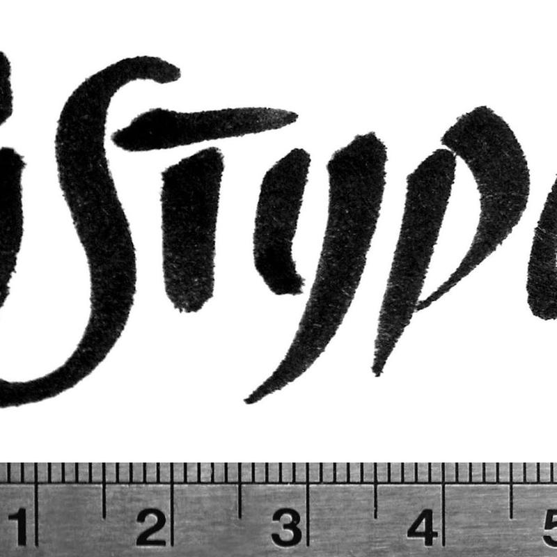
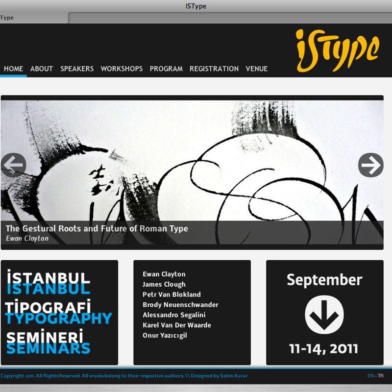
I created the original logo of ISType (Istanbul Type Seminars) with the intention of imbuing the logo symbol with the essential quality of the event: the city of İstanbul and its vibrations, and space, a central quality of writing. The spacing concept is quite subtle: basically, “İST” has a wider tracking compared to “type,” but the two form a solid unity with a stenciled soul. “İS“ is an unconventional ligature that is supposed to stylize some aesthetic expressions of Turkish culture. I drafted the logo with a broad nibbed pen, then digitized it in Fontlab.
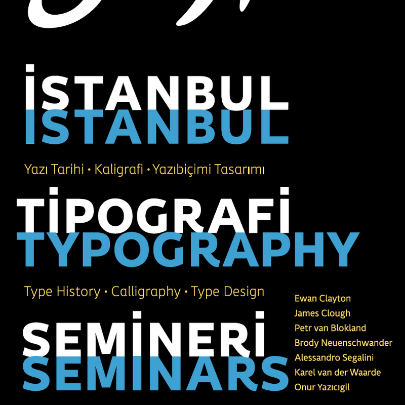
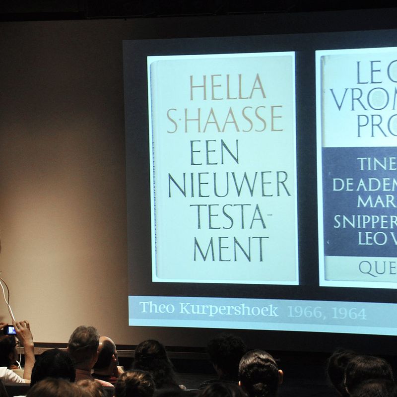
ISType, originally conceived as an annual lecture and workshop series devoted to encouraging typographic literacy in Turkey, is now a biennial international conference that aims to create opportunities for established and emerging designers to share and develop their knowledge of typography.
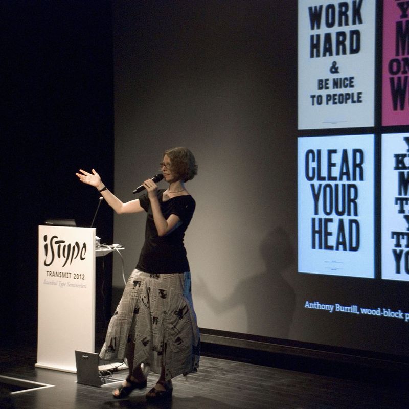
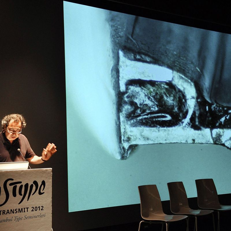
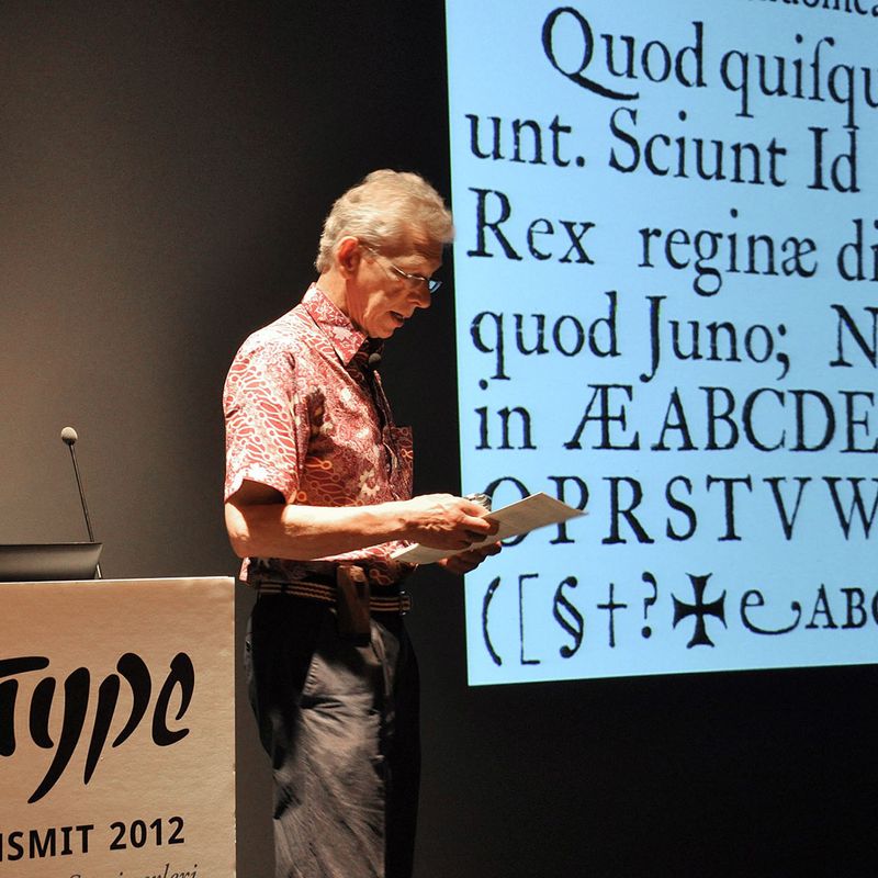
ISType was co-founded by me and Onur Yazıcıgil in 2011 purely out of enthusiasm for the craft and to forge personal type connections. I co-organized the event till 2015. Thank to the generous support of Sabancı University, the industrial sponsors (Adobe, FontShop, MyFonts, etc.) and SALT Galata, we were able to bring renowned thinkers and makers to share their invaluable knowledge and passion. Our speakers included: Robert Bringhurst, Fred Smeijers, Ellen Lupton, John Hudson, Ewan Clayton, Bruno Maag, Karel van der Waarde, Lucas de Groot, Brody Neuenschwander, Adam Twardoch, James Clough, David Lemon, Gerry Leonidas, Petr van Blokland, Thomas Milo, José Scaglione & Veronika Burian, and many others.
Occurring in Istanbul, ISType brings together academics, industry professionals, and students to discuss current issues and innovations in typography and type design, and to reflect upon developments and opportunities for its future growth.
Material: Broad nib pen, ink, paper, Photoshop, Fontlab.
