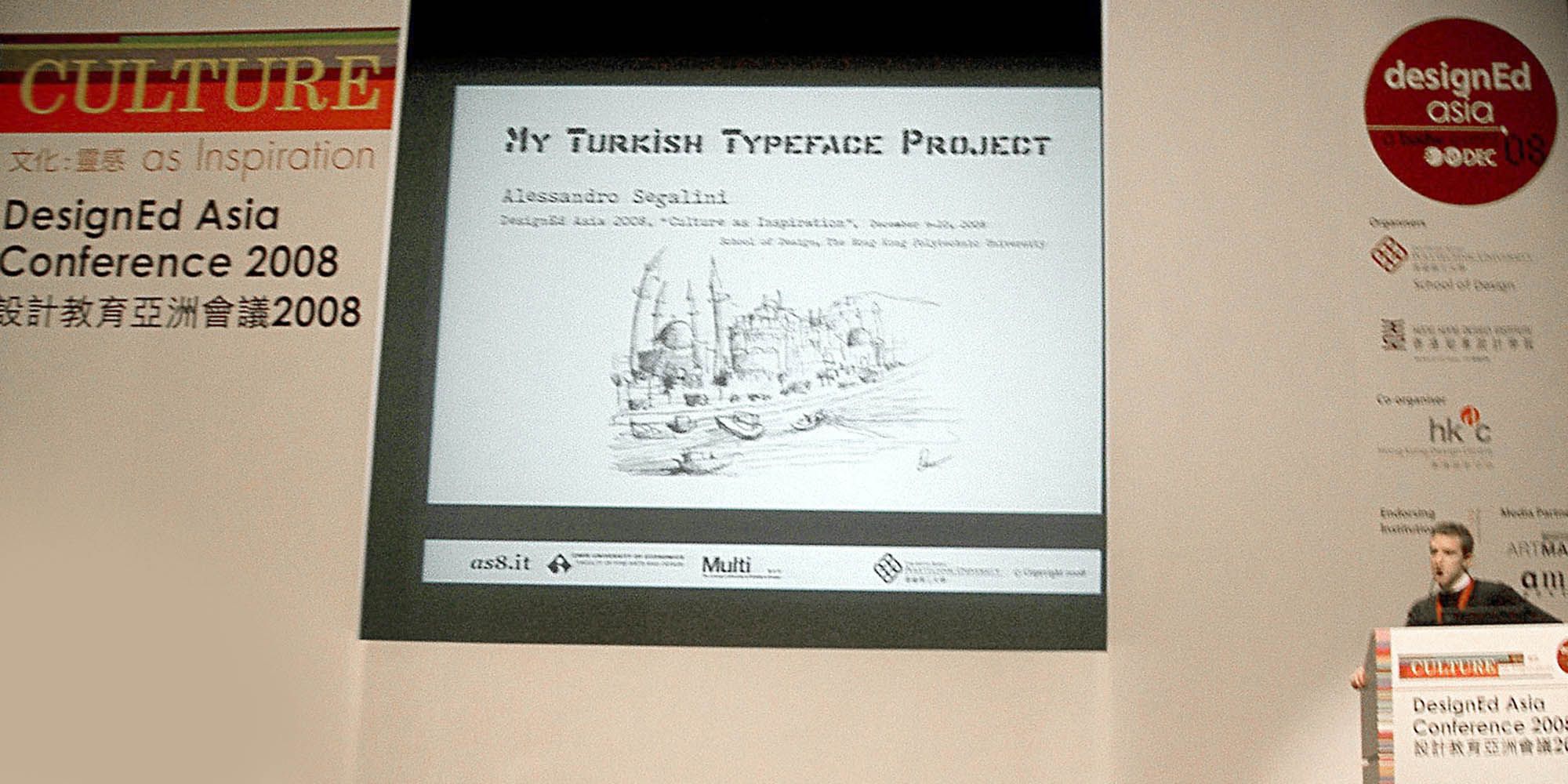
Presentations
Culture As Inspiration
This presentation is the result of an academic design research and a student final project, with outcomes from several classes over a period of three years. The assignment was carried out by junior undergraduate students in my typographic design class at Izmir University of Economics, Izmir, Turkey.
The worksheet or outline clearly stated that, “starting from stylistic references and a few sketches,” the students were asked to draw a typeface — uppercase, lowercase, or a combination with figures — that “aesthetically communicates a certain degree or perspective of Turkishness; a quality that had to be seen or revealed in the details of the letters, hence, in the character. Students had to learn to trust the process and to focus on concept, novelty, unity, systematic thinking, and consistency.
“Turkishness” is the feature and the keyword of the type design project submitted as my contribution to DesignEd Asia 2008 in Hong Kong; the theme conference that year was “Culture As Inspiration” (Aesthetic & Culture; Design Education in the East & West).
When initially a narrative is imposed on the formal design of the typeface, it can easily drop off later, but at least that doesn’t lessen the usefulness of that narrative. The works have been exhibited at “Characters and Identity,” a competition promoted by Izmir University of Economics, Department of Visual Communication Design, in collaboration with the Italian Consulate in Izmir. Cigkofte, one of the typefaces designed for the assignment, was digitized into a TrueType font, here for free download.

