Student work
Page Analysis

Multiple students
ARTS 315 (Communicating with Type) #junior | 2020 | New York, USA
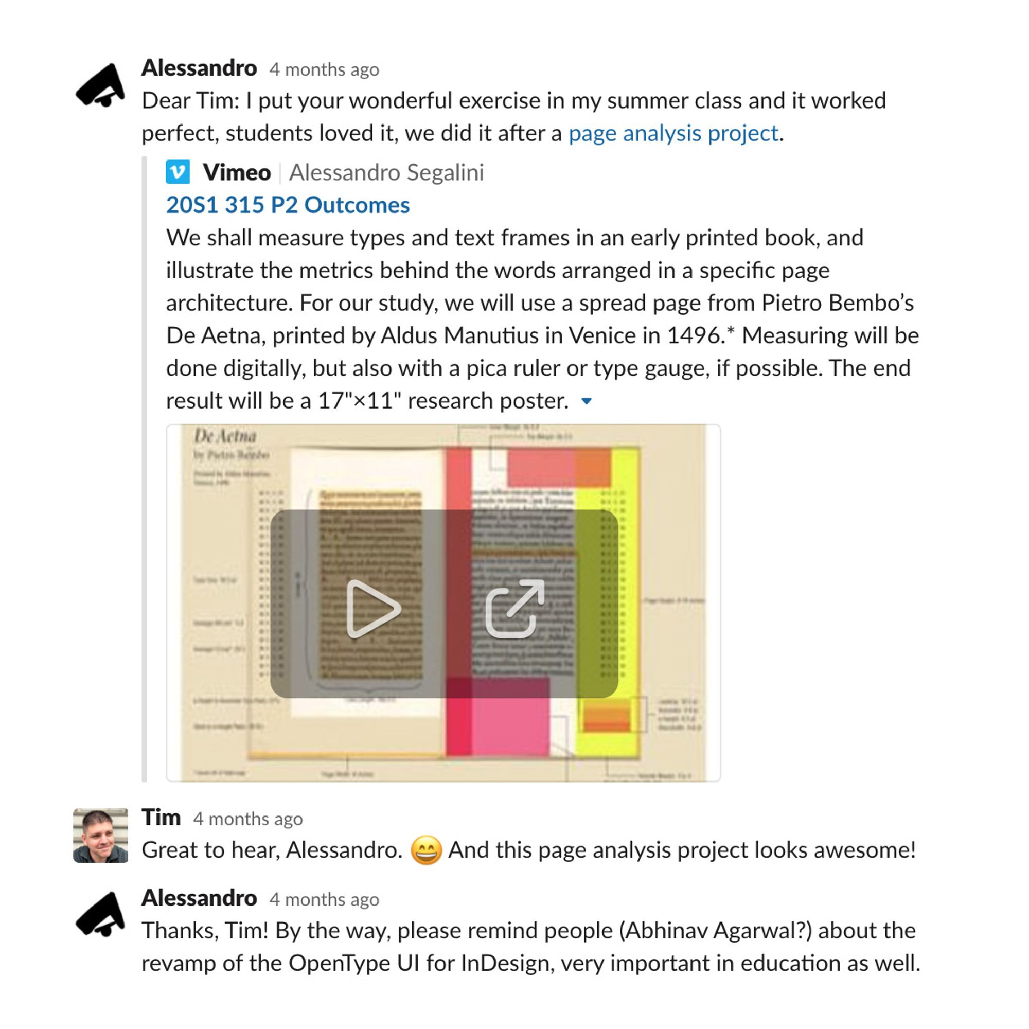
The task challenges students to measure types and text frames in an early printed book, and to illustrate the metrics behind the words arranged in a specific page architecture. For the study, and when visiting the Library Special Collections is not feasible, a spread page from Pietro Bembo’s De Aetna is used, printed by Aldus Manutius in Venice in 1496, set in the archetypal roman (Romanisch/Antiqua) typeface cut custom by Francesco Griffo. Measuring is done digitally in InDesign, but also with a pica ruler or type gauge, if possible. The end result is a 17"×11" research infographic poster.
The objectives of the exercise are:
• Understanding metrics from early an printed book;
• Measuring type and calculating relevant ratios;
• Visualizing typographic parameters.
Material: InDesign, pica ruler, Acrobat.
Some Thoughts on the Roman Type
The various revolutions in script that took place in Italy during the 15th and 16th centuries have been largely ignored by historians who emphasize the three great arts of painting, sculpture and architecture. This seems paradoxical when we consider that the classical ideals of the Renaissance have been disregarded for many generations while the roman letterforms elaborated for Aldus Manutius by Francesco Griffo in Venice and first put to use in the De Aetna of 1496 are identical to those that we see and read in our printed books today. Several of these typefaces (fonts) go under the name of Garamond. In fact about half of the books printed in Italy are set in digital fonts that sport that particular name or others with different names that show letters derived from the De Aetna roman. In 1806, in a note in his translation of Virgil’s Bucolics, Firmin Didot explains that the roman types cut by Claude Garamont in Paris around the middle of the 16th century were copies of the De Aetna roman. The Aldine letters (types) had been introduced to France by Simon de Colines and shaped in turn by Claude Garamont, Robert Granjon and others. Thus we can safely say that, with the changes he made to the Jenson model of roman type (Nicolas Jenson, 1475), Francesco Griffo formulated the main tradition of western typography that continues to this day wherever the Latin alphabet is in use.
A Short History of the Type Gauge
This little chunk of yellow plastic was a computer typesetting device called “haberule™” (named after the famous NYC typeshop, Haber.) It is what every designer used to set type before the advent of the computer. This little device is more than the equivalent of all your computing power and it only cost a few bucks. The catch was, you had to actually use your brain as well.
How it worked is simplicity defined. It’s based on the infamous “printer’s stick” (aka ‘pica stick,’ ‘pica rule,’ ‘agate stick,’ ‘stick’). A “stick” was simply a ruler that old school printers (who also set all the type with their foundry type and lead type systems) use to measure the typography when they composed the pages.
It’s called ‘pica’ because it was all based on the measurements of typefaces as they evolved over the centuries and pica was the original name for the type size that we now call “12 point.” You see pica (being 12pt) shoves type measurement into a base 12 system of measurement (like the clock). There are 12 points (the smallest common unit of measurement) in one pica. 24pt type was the equivalent of 2 picas. 6pt is the same as a half pica. All of these old type sizes originally had actual names for them (fabulous names printers had for these sizes). Since the 12pt size evolved as the most common (for legibility reasons) it evolved as the general unit of measurement. That’s the story of the pica.
A pica stick (aka “stick”) was simply a ruler with measurements set up in picas on the right side and “agate” (another archaic unit of printing measurement that only the very very old school used any more) on the left side. Flip it over and it’s got measurements in inches on the back. This is the basis of the primary element of the haberule™. If you look at the image, you’ll note that the right hand side has ’12’ written at the top of the column. This means 12pt. So, it is a pica rule on the right side. The left side has agate (like I said, almost nobody uses any more).
The genius of the haberule™ is that it also has all the baseline (bottom line where the main body of the type actually rests) measurements for most commonly used type face sizes. This is a brilliant composition tool addition that allows for quick type measurement and rapid composition.
Basically, take 8pt type. If you have, say, 6 inches deep of space to place the type, you can measure down quickly (though the little gap/window in the plastic) to exactly how far down it goes to fit. Easy!
But, how do you know how wide the type fills the column? I mean, how do you know how many letterforms will fit on a single measured line? Well, to do that you had to use your head. There were books in common use around the average designer’s office (type specimen catalogs from local typesetting shops, commercially available collections, salesmen samples, etc.) that had the character count measurements for every typeface imaginable. You simply looked it up and found out how much space the type design required. Using simple math calculations and your haberule, you could set type with extremely exactly precision. To the letter, even.
Unit Conversions
Point, Pica (PostScript)
1 pica = 12 point → #p# notation (1p0 = 0p12)
6 picas = 1 inch = 72 pt.
1pt = 1/72 of an inch = 0.35 mm.
1 cm = 28.5 pt.